A large-scale analysis of Grokipedia, the world’s first AI-written encyclopedia, has found that while many Grokipedia articles closely resemble their Wikipedia counterparts, a substantial subset diverged markedly in style, sourcing, and political leaning. Conducted by Saeedeh Mohammadi and Professor Taha Yasseri, researchers at the Centre for Sociology of Humans and Machines (SOHAM) in Trinity and TU Dublin, the study found that Grokipedia selectively draws on more right-leaning news sources.
Conducted by researchers at the Centre for Sociology of Humans and Machines (SOHAM) in Trinity and TU Dublin, the study compared nearly 18,000 Wikipedia pages with articles on the same topic on the new Grokipedia platform.
A large-scale analysis of Grokipedia, the world’s first AI-written encyclopedia, has found that while many Grokipedia articles closely resemble their Wikipedia counterparts, a substantial subset diverged markedly in style, sourcing, and political leaning.
Conducted by researchers at Trinity College Dublin and Technological University Dublin, the study compared nearly 18,000 of the most-edited English-language Wikipedia pages with articles on the same topic on the new Grokipedia platform.
The study is the largest academic analysis of Grokipedia since it was launched by Elon Musk last October with a promise that the AI-written encyclopedia systematically “fixes” left-leaning biases alleged to exist in the widely used online encyclopedia Wikipedia.
Wikipedia’s content is written and maintained by volunteer editors, while Grokipedia is an AI-generated encyclopedia using the xAI’s Grok large language model.
What did the study find? Using computational text analysis and machine learning methods, the team analysed articles on the same topic across Wikipedia and Grokipedia. Selection of topics was based on Wikipedia’s most-edited English-language pages. The team compared differences in writing style, structure, and the political orientation of external sources referenced in the paired articles.
The researchers found a profound split – while many Grokipedia articles closely mirror Wikipedia, a substantial proportion (66%) of the 18,000 analysed are more extensively rewritten – they are longer, more complex, and rely on fewer references.
As a whole, articles on Grokipedia show similar political leaning to those on Wikipedia, drawing on left-leaning news sources. However, when it comes to the politically and culturally sensitive topics of religion, history, literature and art, Grokipedia shows a consistent shift toward referencing more right-leaning news sources compared to Wikipedia.
The study analysed Wikipedia’s most-edited English-language pages, a selection that likely overrepresents high-profile and contentious topics. That said the study, according to the authors, provides useful evidence of emerging differences between AI-generated and human-edited encyclopedic knowledge systems.
Details of the research, conducted at the joint Centre for Sociology of Humans and Machines (SOHAM) in Trinity and TU Dublin, have been published in the peer-reviewed journal Proceedings of the National Academy of Sciences (PNAS).
What is the impact of this research?
Lead author of the study, Saeedeh Mohammadi, PhD candidate at SOHAM and Research Ireland’s Centre for Research Training in Foundations of Data Science said: “Online encyclopedias are central to public knowledge. They are also being used to train future generations of large language models. Our findings raise important questions about how public knowledge is produced, reproduced, verified, and governed.
“Unlike Wikipedia, where biases are visible and contested through human editing, AI-generated systems operate largely opaquely. This means shifts in perspective or sourcing may occur without clear accountability or editorial oversight. Simply put AI generation does not remove bias – it changes how and where bias enters the system, often making it less visible.”
Professor Taha Yasseri Director of SOHAM and Principal Investigator of the study said: “Rather than systematically ‘correcting’ Wikipedia’s alleged biases, as claimed when first launched, our findings suggest that AI-generated encyclopedias such as Grokipedia selectively reshape existing knowledge. This creates a patchwork system in which some content is copied, while other content is reinterpreted in ways that are less transparent and harder to scrutinise.”
“There is a dire need for transparency, oversight, and regulation in this space. Our information landscape is changing rapidly. We have already seen how the lack of editorial responsibility on social media platforms has enabled the generation and circulation of misinformation and disinformation, often with catastrophic consequences for elections, public health, and social stability. Now, we are witnessing the large-scale, black-box regeneration of information by large language models that remain largely closed to public scrutiny.”
The publication, ‘Selective divergence between Grokipedia and Wikipedia articles’ in Proceedings of the National Academy of Sciences (PNAS) can be read in full on the journal website. The publication has emanated from research supported in part by grants from Research Ireland.
Tomorrow marks 25 years of Wikipedia — a quarter-century of collective knowledge built by millions of volunteers across the globe. Looking at the data tells two very different stories:
The most viewed pages reflect what the world is curious about: countries, wars, pop culture, and major public figures.
The most-edited pages reflect where editors spend their time: complex, constantly changing topics, sports rosters, politics, and living biographies that require continuous updates.
Together, these lists highlight Wikipedia’s unique dual role: a global reference for readers, and a living, evolving project for editors. Below are the Top 50 Most Viewed Articles and the Top 50 Most Edited Articles, all time (2001–2025). Bold entries mark the 16 articles that show up on both charts: they’re among Wikipedia’s biggest magnets for readers and also among its busiest pages for editors.
Most Viewed (million views)
Most Edited (thousand edits)
1. United States (322.8M)
1. List of WWE personnel (59.2K)
2. Donald Trump (243.0M)
2. United States (52.8K)
3. India (236.6M)
3. Donald Trump (50.7K)
4. Elizabeth II (228.5M)
4. George W. Bush (48.6K)
5. World War II (220.9M)
5. List of current UFC fighters (41.9K)
6. United Kingdom (219.4M)
6. Legalism (Chinese philosophy) (39.5K)
7. Michael Jackson (213.7M)
7. Wikipedia (37.9K)
8. Adolf Hitler (210.6M)
8. List of Netflix original programming (37.1K)
9. Sex (207.3M)
9. ATP Tour records (33.7K)
10. Barack Obama (205.5M)
10. Michael Jackson (33.4K)
11. Cristiano Ronaldo (199.8M)
11. Jesus (32.8K)
12. Canada (193.4M)
12. Deaths in 2021 (32.2K)
13. Elon Musk (189.6M)
13. Barack Obama (30.1K)
14. Australia (186.1M)
14. List of programs broadcast by ABS-CBN (29.9K)
15. Lady Gaga (181.9M)
15. Deaths in 2020 (29.7K)
16. Eminem (179.3M)
16. Catholic Church (29.2K)
17. World War I (176.4M)
17. The Undertaker (28.8K)
18. Lionel Messi (175.9M)
18. India (28.6K)
19. Game of Thrones (173.8M)
19. United Kingdom (28.5K)
20. The Beatles (171.5M)
20. Adolf Hitler (28.2K)
21. Justin Bieber (169.9M)
21. World War II (27.9K)
22. Kim Kardashian (168.2M)
22. Britney Spears (27.6K)
23. China (166.8M)
23. Climate change (27.2K)
24. Russia (165.4M)
24. Roger Federer (27.0K)
25. Japan (163.9M)
25. COVID-19 pandemic (26.8K)
26. New York City (162.8M)
26. Deaths in December 2022 (26.8K)
27. Taylor Swift (160.7M)
27. List of countries and dependencies by population (26.7K)
28. Steve Jobs (158.4M)
28. George Washington (26.0K)
29. Dwayne Johnson (157.9M)
29. Beyoncé (26.0K)
30. Michael Jordan (156.8M)
30. List of highest-grossing films (25.9K)
31. Star Wars (155.9M)
31. Deaths in December 2024 (25.8K)
32. LeBron James (154.2M)
32. New York City (25.8K)
33. Germany (152.8M)
33. Turkey (25.8K)
34. September 11 attacks (151.4M)
34. List of GMA Network original programming (25.7K)
35. Leonardo DiCaprio (149.6M)
35. The Beatles (25.4K)
36. Kobe Bryant (148.1M)
36. List of best-selling music artists (25.1K)
37. Selena Gomez (147.5M)
37. European Union (24.9K)
38. Joe Biden (146.9M)
38. List of Impact Wrestling personnel (24.8K)
39. Tom Cruise (146.2M)
39. Philippines (24.6K)
40. Rihanna (145.8M)
40. Real Madrid CF (24.6K)
41. Albert Einstein (145.5M)
41. Canada (24.5K)
42. Academy Awards (145.3M)
42. FC Barcelona (24.5K)
43. Prince Philip (144.7M)
43. Deaths in 2023 (24.5K)
44. Harry Potter (143.9M)
44. Deaths in 2018 (24.2K)
45. Elvis Presley (142.8M)
45. Kane (wrestler) (23.9K)
46. The Walking Dead (142.7M)
46. Newcastle United F.C. (23.9K)
47. Scarlett Johansson (141.3M)
47. Jehovah’s Witnesses (23.7K)
48. Lil Wayne (141.1M)
48. Israel (23.6K)
49. Tupac Shakur (141.1M)
49. Islam (23.6K)
50. Angelina Jolie (140.9M)
50. England national football team (23.6K)
Some articles don’t just attract readers — they also attract constant attention from editors. In fact, 16 pages appear on both the “Most Viewed” and “Most Edited” lists, including countries like the United States, India, China, and the United Kingdom, major historical events such as World War I and World War II, and global figures like Donald Trump, Barack Obama, Adolf Hitler, Michael Jackson, and The Beatles. These are topics that are both widely searched and frequently updated, debated, and expanded.
But most pages only show up on one of the two lists, and that difference is revealing.
The Most Viewed list is dominated by what people are curious about: countries, famous people, wars, pop culture, science icons, and major news events. These pages serve as Wikipedia’s front door, where millions of readers come to quickly learn about the world.
The Most Edited list, on the other hand, reflects where editors spend their time. It features many lists, yearly death pages, sports rosters, and politically sensitive, controversial, or fast-changing topics. These aren’t always the most popular with readers, but they require constant maintenance, updates, and moderation to stay accurate.
Happy 25th birthday to Wikipedia and to its readers and editors, who together make it a living part of the modern information landscape.
Notes: For some early periods, complete monthly pageview records are not available. In those cases, annual totals were estimated using the available data for those months and years, and projected for the missing months. These estimates are intended to reflect overall scale and relative ranking rather than exact historical counts. The edit count data are accurate by the end of 2025.
A few months ago, I was invited to write a short response to a question submitted to the AI Helpdesk—a Dutch-language platform “where anyone can receive scientifically reliable and clear answers to questions about Artificial Intelligence (AI).” The question I was asked to address was: “What are the prospects for AI and Wikipedia?“ Below is the original English version of my answer:
Platforms like Wikipedia are currently experiencing a pivotal intersection with AI, which offers vast potential for developing and improving the online encyclopedia while posing significant risks. By effectively leveraging AI tools, Wikipedia can improve article quality, translation, and accessibility. However, challenges such as misinformation, bias, loss of human editorial input, illusion of consensus, and community disengagement demand attention. A balanced approach, integrating human oversight with AI capabilities, is essential for harnessing benefits while minimising harm.
Opportunities for Collaboration
1. Enhancing Content Quality:
AI tools can assist in generating, editing, and proofreading articles, improving the consistency and accessibility of information. Translation AI enables multilingual access, broadening Wikipedia’s reach globally and ensuring inclusivity.
2. Supporting New Contributors:
By offering automated suggestions, AI can guide new contributors, lowering the barriers to entry and enhancing participation diversity.
Challenges to Address
1. Bias and over-standardization of narrative:
LLMs, trained on dominant narratives, may perpetuate biases or marginalize minority viewpoints (Burton et al., 2024).The use of proprietary training data by LLMs risks reinforcing systemic biases and eroding cultural pluralism.
2. Misinformation and Quality Control:
AI tools lack inherent fact-checking ability, risking the propagation of errors (Yasseri, 2025). Automated edits or content generation without rigorous oversight could compromise Wikipedia’s credibility.
3. Community Dynamics:
Over-reliance on AI might lead to reduced human editorial engagement, undermining the collaborative spirit of Wikipedia (Cui & Yasseri, 2024). Community members may feel displaced if AI assumes tasks traditionally managed by volunteers.
Mitigating Harms: A Balanced Approach
1. Strengthening Human-AI Collaboration:
Employ AI as a tool to assist, not replace, human editors (Tsvetkova et al., 2024). AI can handle repetitive tasks while humans ensure nuance, context, and ethical considerations. AI can even be used to facilitate human users’ deliberation and conversations (Traeger et al., 2020). To this end, transparent AI models, with clear documentation of data sources and decision processes, combined with careful design and task allocation, are essential.
2. Developing AI-Resistant Safeguards:
Wikipedia can implement robust review mechanisms to vet AI contributions. Establishing clear guidelines for integrating AI outputs into Wikipedia’s content will preserve quality and neutrality. Many Wikipedia language editions have local mechanisms to monitor contributions by simple bots, new users, etc. This could be generalized to include contributions that benefited from AI, particularly large language models. Otherwise, we might be dealing with the risk of the illusion of consensus when there is no consensus (Burton et al., 2024).
3. Promoting Digital Literacy:
Empower users to critically evaluate AI-generated content. Public education on the workings and limitations of AI will reduce misinformation risks (Yasseri, 2025). This might be a trivial point to someone familiar with Generative AI, that the content produced by Large Language Models is “made up” and by no means is guaranteed to be factually accurate (at least at the moment). A typical Wikipedia editor might not know this. A typical Wikipedia reader most likely does not know this. Hence, promoting digital literacy could go a long way in mitigating some of these risks.
The Path Forward
AI offers transformative potential for Wikipedia but requires thoughtful integration to align with its mission of providing free, neutral, and diverse knowledge. By embracing a human-centered approach and addressing the challenges of bias, misinformation, and community impact, Wikipedia can continue as a global beacon of collaborative knowledge in the AI era.
References:
Burton, J. W., Lopez-Lopez, E., Hechtlinger, S., Rahwan, Z., Aeschbach, S., Bakker, M. A., … & Hertwig, R. (2024). How large language models can reshape collective intelligence. Nature Human Behaviour, 1-13.
Traeger, M. L., Strohkorb Sebo, S., Jung, M., Scassellati, B., & Christakis, N. A. (2020). Vulnerable robots positively shape human conversational dynamics in a human–robot team. Proceedings of the National Academy of Sciences, 117(12), 6370-6375.
Tsvetkova, M., Yasseri, T., Pescetelli, N., & Werner, T. (2024). A new sociology of humans and machines. Nature Human Behaviour, 8(10), 1864-1876.
Yasseri, T. (2025).The Memory Machine: How Large Language Models Shape Our Collective Past, VerfBlog.
Towards the end of each year, I gather statistics on the most viewed Wikipedia articles of the year. This helps me understand what topics captured the largest collective attention and gives me a chance to reflect on the major public events of the past year. Without further ado, here is the list of the most viewed articles on the English Wikipedia in 2022 with the number of times each article has been viewed during the year:
The statistics seem to accurately reflect the major events of 2022, with a couple of notable exceptions. It’s interesting to see that Cleopatra has been so widely read about on Wikipedia. Do you have any ideas as to why that might be the case?
Here is the list of the top 100 articles with the largest viewership:
A few years ago, one of our MSc students at the Oxford Internet Institute and I analysed some log data (aka big data) that Khan Academy had kindly shared with us. We wanted to see how course-takers interact with videos and quizzes. The analyses were fruitful and the results were interesting (for example, there are generally two types of students, those who fully engage, see many videos and finish them, and those who just click on this and that and soon leave), but we were not very lucky with publishing the paper.
This year, of course as a result of the pandemics, people’s attention once again was drawn towards online learning. So we seized the opportunity and sent the paper to a conference on the topic and the paper is now finally published. Here is the abstract:
With the rise of different forms of online learning platforms and the new ways that people learn in these platforms, new methods of conceptualizing and measuring learning engagement and progression are needed. The availability of large and detailed data about learners’ actions online can provide insight into different aspects of the learning trajectory. This paper (1) highlights micro-lessons as a type of open online learning that is different from other online platforms in its pedagogical approach and affordances, (2) characterizes user interactions with learning resources on a prominent micro-lesson provider, Khan Academy, and (3) constructs and analyzes measures of learning progression based on the theoretical concepts of learners’ grit and growth mindsets using log data of over 300,000 users of micro-lessons. The findings indicate that micro-lessons are most used for just-in-time learning (indicated by single-visits to the platform), rather than attempting to get a more holistic educational experience. Learners’ performance in terms of time taken and the number of attempts to get to a correct answer in practice exercises indicated learning progress over time. This work lays the groundwork for future research to understand how micro-lessons can cater to different learner motivations and how learners’ interactions with micro-lessons fit with their broader learning experience and goals. Future research can also extend this study’s measures of learning progression in other online platforms that do not offer formal assessments.
This is going to be a short post! Using network science, Carla Intal, my former MSc student and current co-author, and I showed (and quantified) the extent of Brexit-driven party distortion in the UK parliament and even predicted the individual MPs’ votes with staggering accuracy. Network science works! Carla has already won the Oxford Internet Institute Best Thesis Award for this work back in 2019, and today our paper after rounds of review, got finally published. Here is the paper abstract (which by the way is Open Access):
The British party system is known for its discipline and cohesion, but it remains wedged on one issue: European integration. We offer a methodology using social network analysis that considers the individual interactions of MPs in the voting process. Using public Parliamentary records, we scraped votes of individual MPs in the 57th parliament (June 2017 to April 2019), computed pairwise similarity scores and calculated rebellion metrics based on eigenvector centralities. Comparing the networks of Brexit- and non-Brexit divisions, our methodology was able to detect a significant difference in eurosceptic behaviour for the former, and using a rebellion metric we predicted how MPs would vote in a forthcoming Brexit deal with over 90% accuracy.
In the months before the pandemic, I was involved in an extensive piece of research into the sex work industry in the UK. Focusing on the main online market for sex work in the UK, AdultWork, we analysed the profiles of more than 11,500 sex workers to understand the industry and how it operates online.
The total number of sex workers in the UK was estimated in 2016 to be slightly over 70,000, so our sample was a substantial portion of the industry (albeit not necessarily a representative sample). The findings, and follow-up work that I have done subsequently, give some valuable insight into the shape of the sex industry in the UK, as well as some of the changes and challenges experienced by sex workers during the pandemic.
One of the main findings from our study, which was recently published in the Journal of Culture, Health & Sexuality, was that more than half of the female sex workers in our cohort were not British. The majority of these non-British workers identified as being from eastern European countries (the next largest was western Europeans, including Spaniards and Germans, but it was a far smaller proportion). Many travelled to the UK for a few weeks of work followed by a return to their home country, where they had family and dependants to feed. Sex work was their main source of income.
We found that eastern European sex workers in the UK charge 30% less than their British colleagues, despite their profiles being viewed by more people on average. The reason for the lower charges has been argued to be because they feel less secure about their job, and because they need a minimum income to cover the cost of hotels, flights and so on and can’t risk ending up with too little.
These workers were often the ones who provided riskier services, such as unprotected sex or extreme BDSM (bondage, dominance and submission/sadomasochism). In many ways, they are also probably the workers who have been most challenged by the pandemic.
Sex work and the pandemic
We have heard a lot about how the pandemic has been very difficult for industries that bring people together such as pubs, restaurants and airlines. Sex work has also been severely challenged by the fact that people have not been allowed to physically interact outside their households in the UK and elsewhere during most of the pandemic.
Unlike most other industries, many sex workers have not been eligible for government support during the crisis. Because many do not have records of their taxed income they have been unable to benefit from the UK income support scheme for self-employed people. This is even more likely to have been the case for the many sex workers in the UK whose primary residence is abroad.
Factors such as clients’ health concerns and limited mobility have reduced demand for sexual services during the pandemic. Reports have also noted that many sex workers turned to offering online services. Yet that does not mean that no in-person sex work has been taking place, as we found during follow-up research. Though it is very difficult to produce comprehensive statistics on the volume of sexual transactions, a simple comparison between the daily number of reviews that clients left on AdultWork after receiving services in 2019 and 2020 suggests there has been no substantial decline in the number of encounters – see the graph below.
AdultWork reviews per day, 2020 vs 2019
Taha Yasseri
Sex work is one of those jobs that has never stopped being demanded and supplied, neither during wars nor famines, so it would be naïve to think otherwise in the case of a pandemic. In fact, the pandemic-induced financial pressure has reportedly made former sex workers return to the sector and many newcomers start working in the profession too.
If the level of business has stayed fairly constant in a market in which the supply has potentially gone up, it means that sex work has become more competitive during the pandemic – and even more so for vulnerable workers at the “low end” of the market. A more competitive market is likely to mean that workers either lower their prices or take bigger risks with the services they provide, or both at the same time. My preliminary analysis shows that the gap between the highest and lowest prices has increased during the pandemic.
On top of that, when meeting people outside of your household is illegal, in-person sex work effectively becomes illegal too (in the UK sex work is normally legal, though various activities, including pimping, running a brothel and soliciting in a public place, are all illegal). This is likely to have meant that vulnerable workers have been taking bigger risks while being afraid of the legal consequences of, for example, going to the police to report an assault by a client.
COVID vaccines for sex workers
Many countries have been prioritising COVID vaccinations based on people’s age, type of job, and pre-existing health conditions. In our analysis, we found out that the majority of sex workers, as well as ones most in demand, were aged between 18 and 36, which puts them at the end of the queue for vaccines.
This would only change if governments recognised that sex work has not stopped in spite of the social-distancing restrictions, and considered the health risks that sex workers take in their day-to-day jobs and the benefits of an early vaccination both for them and society as a whole. At a time when sex workers’ usual access to healthcare support such as GPs and sexual-health nurses has been disrupted, this is something that governments should look into urgently.
This year has started quite stormy in terms of social media contestation and Twitter mess-up. With the attack on the Capitol in January, mostly ignited and organised on Twitter and other social media, platform owners panicked a bit, and started to react. The reaction included Twitter’s birdwatch initiative: a community based campaign for content moderation.
Discussions about the effectiveness of such initiatives and the gain and risk analysis requires extensive research. However, one point that comes to mind looking at the design of most of the content moderation policies is the focus on a single tweet, comment, post, etc., in most of them.
The new Twitter Birdwatch will facilitate collaboration among the community members to produce a fact-checking note to accompany the original tweets. Whilst this might work for certain purposes, it might be completely irrelevant in terms of overall norm formation. In our paper, by analysing millions of tweets coming from thousands of users, we show how different users’ (mis)behaviour have different characteristics and temporal evolution. We identified seven different types of users based on the dynamics of the content they posted over time and showed that these different types are fundamentally different in terms of the volume and rhythm of the hateful content they generate.
Back to the birdwatch and similar initiatives, whilst there are several advantages in policies that target individual tweets, it is important to understand the overall behaviour of a user over time. For instance, one of the user types we identified is the “escalating” haters, consisting of the users whose posted content gradually becomes more and more hateful. What could be more effective than labelling the tweets of such users one by one, would be to identify them early on and have a user level intervention (whatever that could be, perhaps a simple warning followed by more serious interventions if the “escalation” continued).
Such strategies could be more effective in the long term both in stopping hateful content (or even mis-information) from spreading as well as to enforce community norms and to create a more constructive culture on social media.
Type Scores for the seven types of Islamophobia over the 100 time periods. The grey dotted line shows the average tweeting for the entire cohort. Vertical axes’ scales are free to vary. Source: https://doi.org/10.1080/18335330.2021.1892166
Far-right actors are often purveyors of Islamophobic hate speech online, using social media to spread divisive and prejudiced messages which can stir up intergroup tensions and conflict. Hateful content can inflict harm on targeted victims, create a sense of fear amongst communities and stir up intergroup tensions and conflict. Accordingly, there is a pressing need to better understand at a granular level how Islamophobia manifests online and who produces it. We investigate the dynamics of Islamophobia amongst followers of a prominent UK far right political party on Twitter, the British National Party. Analysing a new data set of five million tweets, collected over a period of one year, using a machine learning classifier and latent Markov modelling, we identify seven types of Islamophobic far right actors, capturing qualitative, quantitative and temporal differences in their behaviour. Notably, we show that a small number of users are responsible for most of the Islamophobia that we observe. We then discuss the policy implications of this typology in the context of social media regulation.
This Friday, Wikipedia turns 20 and I thought I should do something about it! I didn’t want to write about how useful Wikipedia is and how it has revolutionised the way we acquire information, or yet again write about edit wars among Wikipedia editors, or perhaps, how we can use Wikipedia to study collective attention or collective memory, or about the controversial topic of Wikipedia bots.
Considering how crazy 2020 was as a year and perhaps one of the years that many of us will remember to the grave, I thought I could put together a little list of most visited articles in different language editions of Wikipedia. Wikimedia Foundation every year releases such a list, however, quite surprisingly, the list is limited to the English Wikipedia only. Wikipedia has 313 different language editions and many of us use more than just the English version when we need to. For millions of people, non-english Wikipedia editions are not only the primary source, but perhaps are THE ONLY freely available source of information on many topics.
In the table below, you see the top 10 most visited articles in my -very biased- selection of 8 language editions of Wikipedia. Let’s have a look and then I’ll highlight few observations!
The second column lists the sister articles in the English Wikipedia. The titles are clickable.
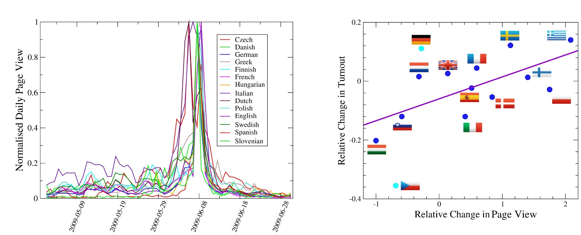
Covid-19 and the pandemic are everywhere! Well, almost everywhere. It’s number one in 6 out of 8 languages. The exceptions are Persian and Arabic Wikipedia. It seems that Persian speaking Wikipedia users have found a very good way to keep busy during the long and boring lockdowns!
After Pandemic related articles (including the Spanish flu, another example of long-term collective memory that Wikipedia facilitates), political figures and heads of state appear most frequently, with Elizabeth II in 4 language editions, followed by Joe Biden and Donald Trump each in the top 10 list of 3 languages. However, Kamala Harris beats Biden in English Wikipedia! Yay!
Maradona didn’t make it to the top 10 of the Spanish list, but he did do in Italian! If you don’t know why, probably you know nothing about Maradona.
Kislovodsk is a seemingly normal spa city in Russia. It took me a while to understand why it became so popular in Russian Wikipedia in 2020. Just see how outstanding the daily page views of the Kislovodsk article looks like below (note the logarithmic scale), and I leave it to you to discover this early Easter Egg!
Notes: All the data and the figure above are taken from https://pageviews.toolforge.org/, where you can explore popular articles in other languages as well as a lot of other fascinating statistics. But be careful with the redirects, different titles of the articles, automated web crawlers, etc!
Museums and galleries in the UK are opening their doors to the public in July. But reopening will be conditional on their ability to implement safety measures. Social distancing is obviously vital in these institutions, which were often described as overcrowded when life was more normal.
To be able to apply social distancing measures we need to know how many people will be there, what they want to see and how they will navigate from one room to another.
These questions were important to the curators and museum owners even before this period of financial uncertainty for the life of many museums. So much so that, in the summer of 2018, our friends at the British Museum approached us with a very simple question: “can you tell us how our visitors move around the museum and can you do it in an easy and cheap way, yet respecting visitors’ privacy?” In response to that, we launched a project at the Alan Turing Institute called: Listening to the crowd: Data science to understand the British Museum’s visitors.
Following the audio guides
In this project, we relied on data generated by the British Museum’s audio guides – little gadgets that about 5% of visitors rent for £7 if they wish to listen to descriptions of different objects in the museum. To play the relevant audio track, visitors need to dial in a code that is unique to each object. The device not only plays the right track for them but also records the object number and the exact time of the request in its memory. It does this mostly for research and service improvement but also it will email a list of all the visited objects to the visitors at the end of the day, as a nice souvenir.
This digital record also tells us about vistors’ physical location in the museum as we can assume they are most likely to listen to the description of an object while standing close to it.
Studying the data of some 40,000 visits, we found the following: most of the visitors spend around 1.5 to three hours visiting the museum. During this time they usually visit between 20 to 45 objects (this only accounts for objects with audio descriptions). Our most important finding was that most of the visitors wander around – they do not necessarily visit all the objects in the same theme nor follow predefined paths (called “tours” – lists of objects that are bundled together by the curators, such as “ancient Egypt” or “highlights”).
Navigating by structures
What actually determines the visitor’s navigation paths more firmly is the physical structure of the museum rather than the thematic distribution of objects, according to our analyses. For instance, the distance of a room from the museum entrance and the number of steps that one needs to climb to get to a room. As such, the siting of the cafe and restrooms can be equally or even more important than the location of the Rosetta Stone.
You are reading this, so there’s a good chance that you’re a museum enthusiast (or a data science enthusiast, or maybe even both), and if so, you might be a bit offended by the last paragraph. You might think that such navigation of museums might be true for the general tourist or “casual” museum-goer, but “seasoned” visitors operate with purpose, knowing what they want to see and usually wanting to see it all.
And you’d be right. Apart from studying the general behaviour, we also tried to categorise visitors based on their navigation patterns. Here are the four types of visitors we found:
Committed trekkers (22% of visitors): usually solo visitors who spent a lot of time in their visit and see many objects with few or no breaks in between.
Leisurely explorers (34% of visitors): often in a group, spending a good amount of time in the museum seeing fewer objects.
Targeted visitors (31% of visitors): shorter visits, see fewer objects, spend more time walking across rooms.
Speedy samplers (12% of visitors): most likely to be part of a group, spend a lot of time walking between rooms and see very few objects.
Remember though, all the visitors we studied were enthusiastic enough to spend £7 for the audio guide. If we could somehow study all the visitors (with and without audio guide), I’m sure the percentages would be different – heavier towards speedy samplers and lighter on committed trekkers.
From left to right: The number of objects of which listened to the description during the visit, average time spent between two stops (minutes), and total visit time (minutes) for the four types of visitor. Muggleton, Monteath, and Yasseri (2020),
Safer museum visits
A restricted and controlled visit – the only viable option at the moment – will be better suited to those who fall into the category of committed trekkers. While those who like to explore, take breaks, and have a more leisurely visit, might need to wait a few more weeks. The new nature of visiting could be emphasised in public communications regarding reopening. This is so that those who would normally be leisurely explorers, targeted visitors or speedy samplers know they will, for the time being, have to adopt different viewing behaviours.
Considering that the distance from the entrance and upward staircases play such an important role, one idea in reopening could be to have multiple entrances and visits limited to single floors.
Finally, considering that many people see a very tiny number of objects on one visit, it could be a good idea to split the museums into multiple isolated sub-museums. Don’t worry that the ancient Greece objects are spread among multiple rooms and two different floors, very few visitors want to see them all in one visit. Also, this gives visitors the excuse to return.
Reopening museums, it is important to know what type of visitors would be more likely to show up at the door and what type of visits would suit them the best. There is still a lot more to understand about visitors but I hope our work can give some basic insights helping the preparation.
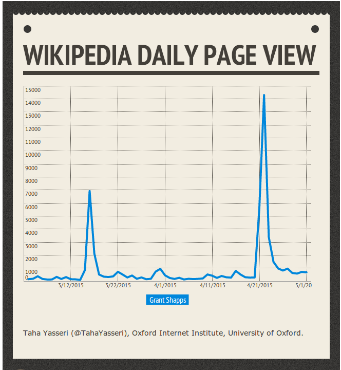
When Dominic Cummings made a public statement to explain why he drove 260 miles to stay with his parents during the coronavirus lockdown, the prime Minister’s chief adviser made an assertion that initially went largely unnoticed:
For years, I have warned of the dangers of pandemics. Last year I wrote about the possible threat of coronaviruses and the urgent need for planning.
It was, ultimately, beside the point but Cummings seemed to be reminding the public of his value. We are to believe that he is too vital a cog in the machine to be forced out of his job.
However, unfortunately for Cummings, it didn’t take the internet nerds long to find out his claim is not exactly true.
In fact, a quick search and check on the Wayback Machine shows only one mention of coronavirus on Cummings’ blog or any other media attached to his name. That mention is in a paragraph that was added to a blog post some time between April 11 and April 15 2020 – several months into the current crisis, when anyone could see coronaviruses were a problem, with or without an eye test. The post was originally released on March 4 2019.
How do we know the lines were added later? And why can’t we tell when exactly the paragraph is added? Let me explain.
A comparison between two versions of Cummings’ blog captured on April 11 and April 15 2020 respectively. Wayback Machine
In the last years of the 1980s, Tim Berners-Lee invented the World Wide Web (WWW) as he was frustrated with how hard it was to find different documents on different computers. His original proposal was a protocol which connects documents regardless of which computer they are stored on and allows readers to navigate between those “hypertext” documents. The first phase of development of the web was supposed to be “read-only”. However, the very first web browser that Berners-Lee released was already a web editor too. Considering the digital nature of the web documents, it would have been stupid to deal with them as “static” objects such those printed on paper.
The web was born as an intrinsically dynamic concept. The network of documents can grow and change and the documents can too.
However, two problems soon appeared. These documents need to be stored somewhere and for many reasons (including scarcity of storage in 1990s) some documents might get deleted. Ironically, the very first webpage ever created seems to have been lost, or at best is sitting on an optical drive somewhere, according to some claims.
The other issue was the need to have access to archives of previous versions of webpages after they’d been changed – say, for legal reasons.
Building an archive
To solve these two problems, ideas of regularly archiving the content of the web started to form in the mid 1990s. In 1996 “The Internet Archive” – an American “digital library” – started to “crawl” the web and make copies of the pages.
There are various other web archivers out there, too, but the Internet Archive arguably has the most comprehensive collection.
The core element of a web archiver is its web crawler – a piece of software that navigates via hyperlinks to visit web pages and copies their content. The Internet Archive has made hundreds of billions copies of most of the pages and made the collection publicly available on its service called the Wayback Machine.
Many of the pages on the web do not change much but some change very frequently and many are frankly not important enough to archive. So the archive does not have the whole history of all the webpages, but it has a good number.
The Internet Archive crawler tries to visit “more important” and “more dynamic” pages more often. For example, Google.com was archived more than 5 million times between November 11 1998 and May 27 2020 – on average around 700 times per day. My university profile page, by contrast, has only been archived 48 times over the past seven years. I might point out that when you compare the 1998 version of the Google frontpage to today’s, there is little change to see. My page has been updated and changed many times. But the number of times that crawlers visit a page are much more influenced by the “importance” of the pages instead of how quickly it changes.
Two screenshots showing the oldest and newest records of Google.com on the Internet Archive (top: 1998, bottom: 2020) Wayback Machine
From the archive we can see that Cummings has been running his blog since 2013 and the first actual post was released in March 2014 – although someone apparently had the domain name since 2004.
There are some 330 versions of his blog saved on the Internet Archive, with many more snapshots taken in recent dates. The earliest one is dated June 29 2017. And, sure enough, as mentioned above, there were two snapshots taken on April 11 and 15. A close comparison of the two shows that the “blue” paragraph in the figure above was added in between these two dates.
Should Cummings’ blog have been more frequently visited by the Archive crawler, we could have determined the exact timing of the change even more precisely. But we at least know that it happened some time during April 2020.
For future reference, you can make the Wayback Machine make a copy of a page if it has no records of the page and you think it should. Archiving is something I’m sure Cummings will think about next time. Remember, the internet never forgets.
About a year ago, Sage Campus contacted me with an offer that I could not refuse! An opportunity to work with a professional team of designers and developers to produce an online course on Research Methods in Social Data Science.
I have been teaching different methods courses in the area of social data science over the past few years, and have been doing research myself in the same area for about a decade, but doing something is very different to teaching how to do that thing. I learnt it hard way!
Obviously, we do design and redesign and think how to frame and reframe our studies and research projects at various stages starting from writing the proposal, all the way to preparing the final publications. However teaching the same process, in a rather abstract medium, is rather challenging. Particularly in a field such as Social Data Science that has a yet forming identity.
I am glad that I accepted the challenge and being privileged to have the great support from Sage, finally managed to design, develop, and publish the course earlier this year.
Among many aspects of the interactive environment of the course, I particularly like the animations which give the course takers an overview of each module in a rather engaging and entertaining way.
The first Cohort of the course was launched in October and I must say the feedback I received from the course takers was very flattering and beyond my expectation! The next cohort is scheduled for March and I cannot wait!
Finally, if you promise not to tell anyone: the course is being turned into a book to be published by Sage next year, but more about that later!
Earlier this year I had the honour of being invited to give a TEDx talk in Thessaloniki. That was an amazing experience, I had never talked to 800+ people, being filmed by 4 cameras, and live broadcasted all at the same time! It was kind of pushing it to limit for me but it was really fun! I must say that the TEDx Thessaloniki team were extremely professional and helpful! The talk is now on youtube, but of course my delivery was slightly different to the script (try to memorize a 15 minutes lecture and then deliver it to a huge crowd!). So, I though I’d post the script here as well as the video!
In November 2015, when the terrorist attacks happened in Paris, the world went into shock. People and nations all around the globe showed their solidarity in different ways: Iconic buildings were lit in the colours of the French flag, candles were lit in the streets, while online, people showed their respect by applying French flag filters to their profile pictures.
Unfortunately, earlier this year, another terrorist attack occurred but this time in New Zealand. 51 innocent people died as a result. Yet not once did I see someone update their profile picture with the NZ flag, let alone an entire building illuminated in its colours! well, mostly because we actually don’t know how the New Zealand’s flag looks like!
Joking aside, you might say, well, Paris is the capital of France and France is central to Europe, which is central to the world, whereas New Zealand is waaay down there, below Australia, in the corner!
You might say, the attacks in Paris were conducted by fundamentalist Muslims, whereas in New Zealand the victims were Muslims and … you know you don’t want to support Muslims on your Facebook profile, particularly if you want to travel to the US in the close future! You might say, in Paris 130 people got killed whereas in New Zealand the number of victims was only 50, so it’s not really worth the trouble of updating your profile picture!
Then I might say, hey how about Sri Lanka? Three weeks ago, there were a series of terrorist attacks by ISIS in Sri Lanka, killing more than 250 Christians, why didn’t we illuminate our buildings then!? You would say, yea, we just said, Sri Lanka is also down there in the corner! We don’t know how their flag looks like either. We might have guessed New Zealand’s flag must look like Australia’s, but have no clue about Sri Lanka’s flag!
You might think I’m joking, but actually all these “excuses” that I listed are observed in a large-scale data analysis that we conducted to measure collective attention and collective memory of people, when it comes to bad news and disasters.
But to measure “public attention” and how much people care about a topic, we had to be creative! As no one wants to walk up to people on the street and ask them: “Hi there, on a scale of 1 to 10 how much do you care about this disaster?” So instead, we turned to the internet, where people willingly share, with everyone, exactly how much they care!
In particular, we focused on how people reacted to airplane crashes. To do this, we looked at airplane crash articles on Wikipedia and counted how many times people viewed them within the first week after the crash. Wikipedia has been around since 2001 and since then we have had more than 200 crashes. First thing we observed was that there is a big difference in the amount of attention that events trigger if the number of casualties is smaller or larger than 50 people. Basically, events with more than 50 deaths create much more public attention. That was a finding very well received by terrorist groups all around the world!
Then we thought what about the nationality of passengers, does, let’s say, an American death receive the same amount of attention to a Greek death? (as a Persian I’m historically very excited to talk about Greek deaths! I mean ancient Greeks; you guys are ok!) It was hard to determine the nationality of all the victims on all these flights, and the exact location of a crash is not always known. But we could easily extract the subcontinent of the operating airlines. And guess what, we found that on average, when an airplane involved in a crash was operated by a North American airline, the attention the crash was likely to receive was 50 times more than if the plane had been operated by an African airline with the same number of deaths!
A European death on average triggers 16 times more attention than an Australian death! So, Australian countries are really in the corner!
These analyses were based on data we collected from English Wikipedia. We repeated the same analysis using Spanish Wikipedia, and the good news was that we found that the readers of Spanish Wikipedia are equally racist! There, the largest attention is given to the Latin American flights of course.
Of course, we are biased when it comes to how much we care about things and places. We care much more about things that are similar to us, closer to us, and … benefit us!
Let’s have a look at this map:
Cornell University – PJ Mode Collection of Persuasive Cartography
This is one of my favourite maps. Here we have the British Isles in the middle, China at the left side, the rest of Europe, Africa and the rest of Asia are here at the right side. Oh, and here are the Americas. Yea, okay, so the map is a little bit odd. But hey, I didn’t make it up. It was in fact produced by an English Tea Merchant in 1930’s who titled it “The World”. UK is big and right in the centre. Which of course, from his point of view “the world” would look like this. And also, from the point of view of some 17.5 million people in the UK who voted for Brexit!
But let’s not point fingers. I mean, we all have our own inner English Tea Merchant! Our perception of the world, countries, and most importantly humans is as distorted and biased as this map. And not only our perception, but simply how much we care about the world and humans.
Interestingly, the Internet is a great tool to show us these biases. Because everything that we do on the Internet leaves a digital footprint and by analysing the data generated by our activities on the Internet, we can have a global-scale picture of our behaviour, similarities, differences, biases and subjectivities. Sometimes all we need for change is a mirror that we can see ourselves in.
But Internet also provides us with one more thing. No, I mean apart from the increasingly degrading pornography! Internet, provides us with the sum of the human knowledge! And cat videos. Let’s focus on the first one. We have things like Wikipedia that I mentioned, Wikipedia is the largest repository of human knowledge online, That is to say collection of human knowledge that is mostly collected by young, white men from rich countries, but still!
To be fair, what distinguishes Wikipedia from other things that are produced and written by rich, white men, is that theoretically it’s open to everyone. Any person who can read Wikipedia can also edit it. That of course leads to huge editorial wars that I have spent a large portion of my short career studying. But these edit wars are exactly what makes Wikipedia reliable and great! Articles get edited again and again and after a while they are so well polished that all the editors are happy with them.
Another interesting thing about these huge online repositories are that unlike paper-based encyclopaedias, people actually use them! Whenever a new crash is reported, people flock to the site to read about it. If we then trace the paths of these readers to see what they read next, we find they continue to engage with Wikipedia to learn about previous airplane disasters. Which in turn, inflates the attention that these previous crashes receive to such an extent that new interest completely overshadows the initial attention that a plane crash page received when it was first reported!
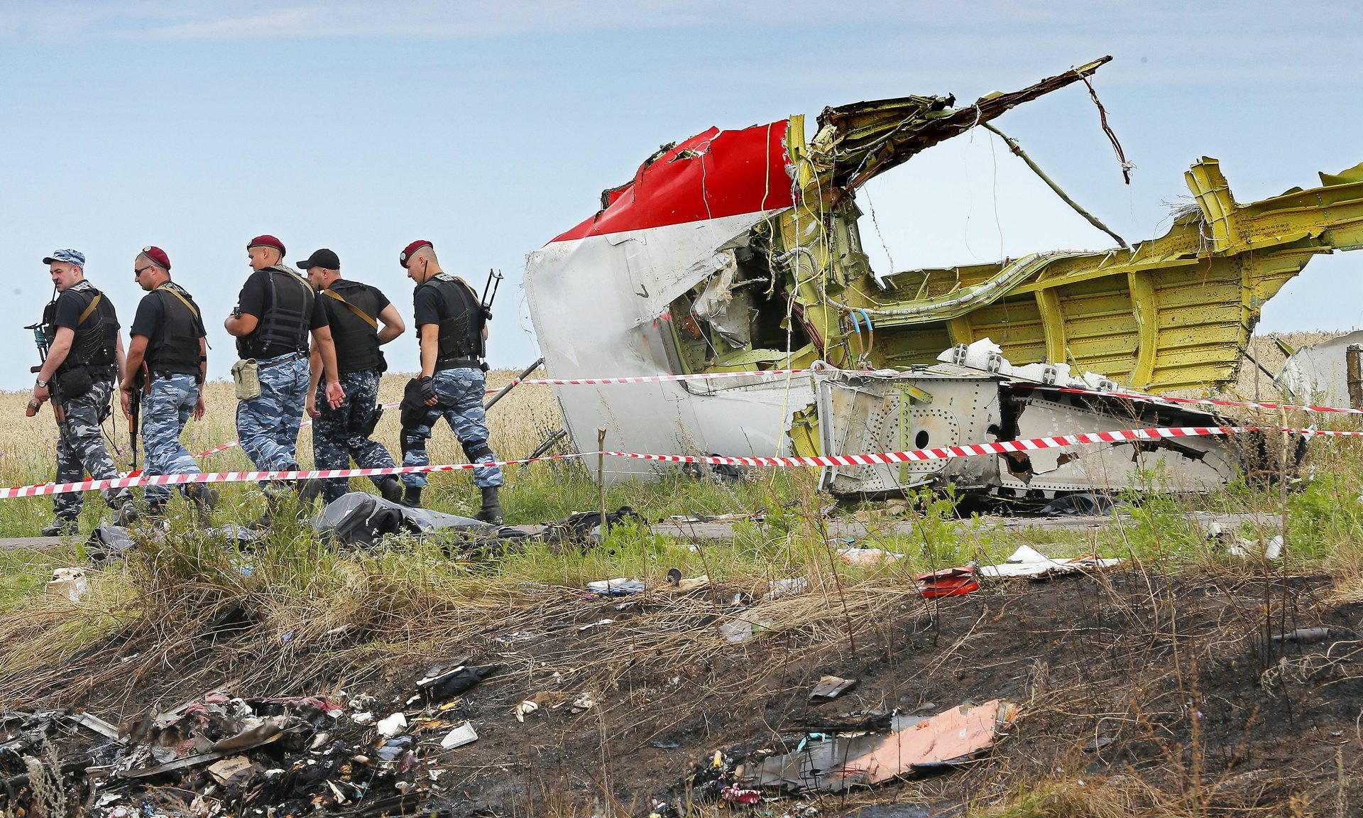
For example, when the Malaysia Airline passenger flight was shot down by military missile in 2014, not only did many people read about this event on Wikipedia, but also, we could see a significant increase in the readership of the article about a similar event in which an Iranian commercial flight was shot down by US Navy in 1988 killing 290 normal citizens and flight crew.
It’s not only you who goes to Youtube to quickly watch the match highlights of yesterday’s game and ends up watching all football videos that have ever been uploaded to the Internet! Analysing these traces of Wikipedia users, we also found other interesting patterns. For example, we saw that the flow of attention from a new crash is bigger to the old crashes that are more similar in cause and geography, and are closer in time. So, our collective memory is biased just like our collective attention. For instance, the flow from current events to past events starts to vanish if the time separation between them exceeds 40 years.
So although we’re interested in past events, there is a limit to how far back we’re actually willing to go! With many people more interested in recent historical events over those that occurred over 40 years ago. That may not sound great, but the fact that we are just a few clicks away from the whole history of human kind, and that current events trigger our interest in exploring the past is an entirely Internet-mediated phenomenon.
The last thing about the Internet, is that it also connects us! It theoretically connects us to literally any other human on this planet with access to the Internet. And Justin Bieber! Think about Twitter, the conversations that it hosts around live events, political topics, cultural phenomena, during which millions of users from all round the world join in and talk -and troll- each other all at the same time! This has never been possible in the history of mankind to have such a huge “town hall” or as you say “agora”. Of course, we criticise social media and Twitter, particularly for certain things such as fake news, hate speech and limiting our attention to people that are similar to us and putting us in filter bubbles, but remember! We created the Internet, and it resembles our offline world.
Fake news and hateful speech have existed for a very long time.
Many people argue that these are the main ingredients of popular media. When it comes to filter bubbles we only need to go back 30 years ago (because who wants to go back 40 years imma right!), to find that the majority of people were exposed to only one newspaper, very few TV channels and could only really interact with very similar people within their vicinity on a daily basis. For instance, people at their local church or their fellows at their regular strip club.
But today, thanks to the Internet, we are only a few clicks away from alternative news outlets and people with opposing ideologies. Unfortunately, we chose not to interact with people of different opinions much, and social media platforms encourage us to trim our social ties, keep the ones we like, and avoid facing people who are different. But if we want, we can easily break the bubbles and expose ourselves to a whole different environment. Step out of our comfort zone and use this opportunity to get closer to one another.
Remember, the same technology that these days we claim is killing our democracies and wiping out our civilizations, just a bit more than a decade ago, led to the creation of something like Wikipedia. Of course, the difference in Wikipedia is that people of opposing opinions HAVE To work together and get to a consensus, whereas on social media we are also just one click away from removing a connection or ending a friendship.
We have only just arrived on planet Internet. A planet whose geography, size, pace, and physics are all over the place! They are nothing like what we have experienced before in the thousands of years of human social history. We have to start discovering the rules of nature all over again! But as scary as that sounds, this also means we have the chance to grow and learn like never before! We haven’t done great on planet earth and we have almost destroyed it. But let’s do better with the Internet! We can unite or stay divided. But we can and we should save the Internet. Because the Internet is the new land.
In a recent work, we studied music listenership patterns of 1.3 million online users to measure the direct and indirect effects of live concerts on song plays. We observe social contagion for only a certain type of musician and discuss how it can affect the music market.
The Internet has fundamentally reshaped music and other cultural markets. The ubiquity of music in the digital world had been presciently predicted by David Bowie who envisioned the future of music as something akin to running water or electricity. And indeed, we are now one tap-of-the-finger away from almost any music track that we want to listen to—at almost no cost. This is a remarkable departure from a time when most music had a physical embodiment in the form of records, tapes, CD’s, or even MP3 players. Today, music is in the air.
An important question now is how does this revolutionary change affect the music market? More precisely, how are musicians supposed to make money? A rather straightforward answer is through live events and concerts, but is the revenue of a concert or tour limited to exclusively ticket sales and broadcast revenues? It has been argued that live events stimulate secondary and indirect sources of revenue by growing the musician’s fanbase, which itself leads to more sales.
In this work, however, we find evidence that music listenership can be contagious. Namely, a live event not only can increase listenership among people who attend the event, in certain cases, it can “infect” the non-attendee listeners who are in the social proximity of concert attendees. The contagion however is complex, meaning that its dynamics are not defined by the structure of the underlying social network. We show that the fame of the musician plays an important role in moderating the size of the contagion.
While the increase in listenership of fans who attended a concert is about the same no matter the type of artist, the secondary effect on non-attendees is much larger for well-known artists as compared to emerging stars (the so-called “hyped” artists).
Putting it simply: if my friends attend a concert featuring a band that I am likely to know—let’s say Metallica—it is likely to increase the number of Metallica songs I listen to just after the event. But if a band is less popular (and perhaps I have not heard of them), there is no such secondary effect.
The additional income that the social contagion can bring for a typical concert, according to our most conservative estimates can be as much as a few thousand dollars per event. But as this additional income can only be recovered by the most established artists, a rich get richer mechanism holds, further increasing the existing inequality in the market.
In the era of Myspace, it was widely believed that the Internet is democratizing the music industry. We may need to rethink such a conclusion; considering how social influence can create avalanches of attention and revenues for bigger names at the expense of other, less well-known artists, the Internet might not be so egalitarian after all. While there is certainly an unparalleled opportunity for new artists to make their work available to the world via such platforms as SoundCloud, they may have difficulty being heard over the songs of the well-established, big-name musicians.
The modelling paradigm that we adopted in this work is abstract enough to be applicable to other collective behaviour in online media. Political engagement, participation in public good actions, and the spread of (mis)information are a few examples. How social media can affect these “markets” via social influence and contagion is among the most important questions facing computational social scientists today.
A paradoxical advantage of studying online systems is that the very same technology that is reshaping our personal and social behaviour generates unprecedented amount of data that can be utilized to study the very same changes. And this may be what makes Social Data Science the fastest growing field of research today.
We used computational text mining techniques to analyse the content of some 80 thousands stories of everyday instances of sexism posted on the Everyday Sexism website.
Our results suggests that sexism is fluid; it’s not limited to a certain space, class, culture, or time. It takes different forms and shapes but these are connected. Sexism penetrates all aspects of our lives, it can be subtle and small, and it can be violent and traumatizing, but it is rarely an isolated experience.
Network visualizations of the topics. The weight of the connections between pairs of the topics is based on the similarity of how the words are assigned to them.
The abstract of the paper reads:
The Everyday Sexism Project documents everyday examples of sexism reported by volunteer contributors from all around the world. It collected 100,000 entries in 13+ languages within the first 3 years of its existence. The content of reports in various languages submitted to Everyday Sexism is a valuable source of crowdsourced information with great potential for feminist and gender studies. In this paper, we take a computational approach to analyze the content of reports. We use topic-modeling techniques to extract emerging topics and concepts from the reports, and to map the semantic relations between those topics. The resulting picture closely resembles and adds to that arrived at through qualitative analysis, showing that this form of topic modeling could be useful for sifting through datasets that had not previously been subject to any analysis. More precisely, we come up with a map of topics for two different resolutions of our topic model and discuss the connection between the identified topics. In the low-resolution picture, for instance, we found Public space/Street, Online, Work related/Office, Transport, School, Media harassment, and Domestic abuse. Among these, the strongest connection is between Public space/Street harassment and Domestic abuse and sexism in personal relationships. The strength of the relationships between topics illustrates the fluid and ubiquitous nature of sexism, with no single experience being unrelated to another.
In a recent paper, we studied 40 stock markets from top GDP countries to analyse the correlations and connections between them. As expected, we did observe strong correlations between ups and downs of these markets at the global level. However, when using Random Matrix Theory we detected the sub-communities of this global network, we realised that geography plays an important role.
In this “Brexity” times, the most notable observation is how deep the UK market are embedded in the sub-network of European markets. We often hear that the European partners can be replaced with the US and China. The numbers do not support this!
Dendrogram of the forty markets based on their cross-correlations. The colored groups contain members with at least thirty percent of correlation. The top six markets do not belong to any group.
The paper’s abstract reads:
Forty stock market indices of the world with the highest GDP has been studied. We show each market is a part of a global structure, that we call “world-stock-market network”. Where the correlation between two markets is not independent of the correlation between two other markets. Towards this end, we analyze the cross-correlationmatrix of the indices of these forty markets using Random MatrixTheory (RMT). We find the degree of collective behavior among the markets and the share of each market in the world global network. This finding together with the results obtained from the same calculation on four stock markets reinforces the idea of a world financial market. Finally, we draw the dendrogram of the cross-correlation matrix to make communities in this abstract global market visible. The results show that the world financial market comprises three communities each of which includes stock markets with geographical proximity.
Many think that corruption is a result of wealth or the lack of it. Some assume that tighter regulations might stop corruption. Hence, socio-economic metrics have been used to explain the level of corruption in different places with different regulatory regimes.
In our recent work, we show that corruption is in the fabric of the societies and the structure of the social networks in cities are highly related with the chance of corruption. Certain characteristics of a towns’ social ties, such as fragmentation or diversity of residents’ connections, measured via an online social network, predict corruption in local government contracting above and beyond socio-economic variables.
Here is the abstract of the article:
Corruption is a social plague: gains accrue to small groups, while its costs are borne by everyone. Significant variation in its level between and within countries suggests a relationship between social structure and the prevalence of corruption, yet, large-scale empirical studies thereof have been missing due to lack of data. In this paper, we relate the structural characteristics of social capital of settlements with corruption in their local governments. Using datasets from Hungary, we quantify corruption risk by suppressed competition and lack of transparency in the settlement’s awarded public contracts. We characterize social capital using social network data from a popular online platform. Controlling for social, economic and political factors, we find that settlements with fragmented social networks, indicating an excess of bonding social capital has higher corruption risk, and settlements with more diverse external connectivity, suggesting a surplus of bridging social capital is less exposed to corruption. We interpret fragmentation as fostering in-group favouritism and conformity, which increase corruption, while diversity facilitates impartiality in public life and stifles corruption.
Ego networks with low (a) and high (b) diversity. Colours indicate membership in detected communities in the ego network. Circles denote users from the same settlement as the ego, while triangles mark users from elsewhere. The high diversity user’s network has clusters of alters mostly from different settlements.
Wikipedia is arguably the number one source of information online for the speakers of many languages. But not all the different language editions are developed equally. The English edition is by far the largest and the most complete one, and the other 280 language editions have many fewer articles.
The coverage of different language editions also doesn’t follow a standard template. Some language editions are heavier on politics, for instance, and some have more articles on science related topics, leading to even different populations of controversial topics in different languages. Why does the coverage of different editions vary so much?
You might think it’s to do with the emphasis different cultures place on different subjects, or the ease of explaining a topic in a certain language. But new research has found a surprising pattern among the different editions of Wikipedia. It suggests the shape of the site’s growth is much more complex and tied to the different community of editors who build each edition.
A recent study, published in the journal Royal Society Open Science, analysed the patterns of some 15,000 article topics that have been covered in at least 26 language editions. The researchers looked at the sequence of languages that each article has appeared on chronically and tried to mine patterns in the trajectory that the article navigates through from one language to another.
Using different computational techniques, they managed to cluster languages into groups that mimic similar coverage patterns. Among the 26 languages that the authors analysed, English, German, and Persian stand out and do not mix with any other groups of languages. But there are three more groups that are mostly robust even when the authors change the algorithm they used for clustering.
Italian, Finish, Portuguese, Russian, Norwegian, Mandarin and Danish stick together. Polish Dutch, Spanish, Japanese, French, and Swedish cluster together. And finally, Indonesian, Turkish, Hungarian, Korean, Ukrainian, Czech, Arabic, Romanian, Bulgarian and Serbian show similar patterns.
What is surprising is that these grouping can’t simply be explained by language families, geographical closeness, or cultural similarities. What seems to be the underlying factor is more related to the characteristics of the community of editors of each language edition.
To test this systematically, the authors considered six factors for each language edition. These included the number of pages, the number of edits, the number of administrators and a measure of the content quality. The other two factors were the total number of active speakers of the language and the level of access they had to the Internet using the international Digital Access Index ranking for the country in which the language is primarily spoken.
These six parameters partially explain the differences between different clusters, but the authors suggest that the clustering of the languages is driven by a more complex combination of socio-economic variables that can capture features such as the average Internet literacy in a country or the general attitude towards the importance of knowledge and education.
The results of this paper become more interesting when compared to an earlier work that looked at the time of the day that edits are mostly committed in each language edition. While generally Wikipedia is edited during the afternoon and early evening, some language editions are being edited more in the morning and some later in the evening.
When you look at these groups of languages, there seem to be similar patterns. Unfortunately the set of languages studied in the two works are not the same and so a direct comparison is not possible.
What this research does is remind us how little we know about how information is being spread on the Internet, what the patterns of the online information landscape are and more importantly, what factors determine these patterns. The role of the Internet and the information resources it provides, in formation of our opinions and decisions that we make at the individual and societal level is undeniable. Answering these questions might help us to achieve a more democratic and unbiased global information repository.
I’m very happy that a favourite!! paper of mine is finally published in EPJ Data Science. The paper that is titled “Rapid rise and decay in petition signing” tries to analyse and model the dynamics of popularity of online petitions.
Traditionally, collective action is known to follow a chain-reaction type of dynamics with a critical mass and a tipping point that could be all described with an S-shaped curve (schematically shown in Figure below), however, we spent about 3 years to only fail at finding any type of Sigmoid function that can fit our data!
The S-curve of success that is not relevant anymore!
Instead, we tried to a fit a multiplicative model with a strong decay modification. That was a much better fit to the data. It grows exponentially at the beginning, but then comes a very rapid decay in the novelty of the movement. Remember, our attention span is very short in the digital age!
Apart from the mathematical details of this fitting exercise, there are important consequences emerging from this observation:
Online collective actions have very different dynamics to what we know from traditional offline movements.
Online movements are explosive and much less predictable.
The typical time-scale of such movements is in the range of hours and few days at longest, not weeks or years!
This fast dynamic is independent of the extent of the success and prevalence of the movement.
Instead of reaching a critical mass in later stages of a movement, one has to try to have a large initial momentum in order to success.
There is more to this obviously and if you’re interested, please have a look at the paper here.
The abstract of the paper reads:
Contemporary collective action, much of which involves social media and other Internet-based platforms, leaves a digital imprint which may be harvested to better understand the dynamics of mobilization. Petition signing is an example of collective action which has gained in popularity with rising use of social media and provides such data for the whole population of petition signatories for a given platform. This paper tracks the growth curves of all 20,000 petitions to the UK government petitions website (http://epetitions.direct.gov.uk) and 1,800 petitions to the US White House site (https://petitions.whitehouse.gov), analyzing the rate of growth and outreach mechanism. Previous research has suggested the importance of the first day to the ultimate success of a petition, but has not examined early growth within that day, made possible here through hourly resolution in the data. The analysis shows that the vast majority of petitions do not achieve any measure of success; over 99 percent fail to get the 10,000 signatures required for an official response and only 0.1 percent attain the 100,000 required for a parliamentary debate (0.7 percent in the US). We analyze the data through a multiplicative process model framework to explain the heterogeneous growth of signatures at the population level. We define and measure an average outreach factor for petitions and show that it decays very fast (reducing to 0.1% after 10 hours in the UK and 30 hours in the US). After a day or two, a petition’s fate is virtually set. The findings challenge conventional analyses of collective action from economics and political science, where the production function has been assumed to follow an S-shaped curve.
This paper has emerged from my former MSc student at the Oxford Internet Institute, Pu Yan, who is currently working on her PhD in our department.
In this paper we combined a network analysis tool with computational linguistic methods to understand the differences in the ways that Guanxi is conceptualized in two different Chinese cultures (Mainland vs Taiwan, Hong Kong, and Macau).
What I like about this paper is the discussion of the results rather than anything else. Pu, with her great domain knowledge, interprets the results in a very insightful way.
Guanxi, roughly translated as “social connection,” is a term commonly used in the Chinese language. In this study, we employed a linguistic approach to explore popular discourses on guanxi. Although sharing the same Confucian roots, Chinese communities inside and outside Mainland China have undergone different historical trajectories. Hence, we took a comparative approach to examine guanxi in Mainland China and in Taiwan, Hong Kong, and Macau (TW-HK-M). Comparing guanxi discourses in two Chinese societies aim at revealing the divergence of guanxi culture. The data for this research were collected on Twitter over a three-week period by searching tweets containing guanxi written in simplified Chinese characters (关系) and in traditional Chinese characters (關係). After building, visualizing, and conducting community detection on both semantic networks, two guanxi discourses were then compared in terms of their major concept sub-communities. This study aims at addressing two questions: Has the meaning of guanxi transformed in contemporary Chinese societies? And how do different socio-economic configurations affect the practice of guanxi? Results suggest that guanxi in interpersonal relationships has adapted to a new family structure in both Chinese societies. In addition, the practice of guanxi in business varies in Mainland China and in TW-HK-M. Furthermore, an extended domain was identified where guanxi is used in a macro-level discussion of state relations. Network representations of the guanxi discourses enabled reification of the concept and shed lights on the understanding of social connections and social orders in contemporary China.
About a month ago, we finished our 2-year long EC-Horizon2020 project on Human-Machine Networks (HUMANE). The first task of this project was to perform a systematic literature review to see what the state of the art in understanding such systems is.
The short answer is that we do not know much! And what we know is not very cohesive. In other words, design, development, and exploration of human-machine systems have been done mostly through trial and error and there has not been much theory or systematic thinking involved.
We wrote a review paper to report on our systematic exploration of the literature. It took us nearly 18 months to finally get the paper published, but it was worth every second waiting as we managed to get it out at the ACM Computing Survey, which has the highest impact factor among all the journals in Computer Science.
In the current hyperconnected era, modern Information and Communication Technology (ICT) systems form sophisticated networks where not only do people interact with other people, but also machines take an increasingly visible and participatory role. Such Human-Machine Networks (HMNs) are embedded in the daily lives of people, both for personal and professional use. They can have a significant impact by producing synergy and innovations. The challenge in designing successful HMNs is that they cannot be developed and implemented in the same manner as networks of machines nodes alone, or following a wholly human-centric view of the network. The problem requires an interdisciplinary approach. Here, we review current research of relevance to HMNs across many disciplines. Extending the previous theoretical concepts of socio-technical systems, actor-network theory, cyber-physical-social systems, and social machines, we concentrate on the interactions among humans and between humans and machines. We identify eight types of HMNs: public-resource computing, crowdsourcing, web search engines, crowdsensing, online markets, social media, multiplayer online games and virtual worlds, and mass collaboration. We systematically select literature on each of these types and review it with a focus on implications for designing HMNs. Moreover, we discuss risks associated with HMNs and identify emerging design and development trends.
Our short-term collective memory is really short; shorter than a week, and it’s biased, and our long-term memory is pretty long, about 45 years, also biased, nevertheless modellable! And the Internet plays important roles in both observations and also helps us to quantify and study these patterns.
Of course, we have reported few other facts and observations related to our collective memory, but the main message was that.
We report that the most important factor in memory triggering patterns is the original impact of the past event measured by its average daily page views before the recent event occurred. That means that some past events are intrinsically more memorable and our memory of them are more easily triggered. Examples of such events are the crashes related to the 9/11 terrorist attacks.
Time separation between the two events also plays an important role. The closer in time the two events are, the stronger coupling between them; and when the time separation exceeds 45 years, it becomes very unlikely that the recent event triggers any memory of the past event.
The similarity between the two events has turned out to be another important factor; This happens in the case of the Iran Air flight 655 shot down by a US navy guided missile in 1988, which was not generally well remembered but far more attention was paid to it when the Malaysia Airlines 17 flight was hit by a missile over Ukraine in 2014.
Page-view statistics of three recent flights (2015) and their effects on the page-views of past events from 2014, and events from 1995 to 2000. The recent events cause an increase in the viewership of some of the past events.
Recently developed information communication technologies, particularly the Internet, have affected how we, both as individuals and as a society, create, store, and recall information. The Internet also provides us with a great opportunity to study memory using transactional large-scale data in a quantitative framework similar to the practice in natural sciences. We make use of online data by analyzing viewership statistics of Wikipedia articles on aircraft crashes. We study the relation between recent events and past events and particularly focus on understanding memory-triggering patterns. We devise a quantitative model that explains the flow of viewership from a current event to past events based on similarity in time, geography, topic, and the hyperlink structure of Wikipedia articles. We show that, on average, the secondary flow of attention to past events generated by these remembering processes is larger than the primary attention flow to the current event. We report these previously unknown cascading effects.
Collaboration is among the most fundamental social behaviours. The Internet and particularly the Web have been originally developed to foster large scale collaboration among scientists and technicians. The more recent emergence of Web 2.0 and ubiquity of user-generated content on social web, has provided us with even more potentials and capacities for large scale collaborative projects. Projects such as Wikipedia, Zooniverse, Foldit, etc are only few examples of such collective actions for public good.
Despite the central role of collaboration in development of our societies, data-driven studies and computational approaches to understand mechanisms and to test policies are rare.
Our model is very simple and minimalistic and therefore the results can be generalized to other examples of large scale collaboration rather easily.
We particularly focus on the role of extreme opinions, direct communication between agents, and punishing policies that can be implemented in order to facilitate a faster consensus.
The results are rather surprising! In the abstract of the paper we say:
… Using a model of common value production, we show that the consensus can only be reached if groups with extreme views can actively take part in the discussion and if their views are also represented in the common outcome, at least temporarily. We show that banning problematic editors mostly hinders the consensus as it delays discussion and thus the whole consensus building process. We also consider the role of direct communication between editors both in the model and in Wikipedia data (by analyzing the Wikipedia talk pages). While the model suggests that in certain conditions there is an optimal rate of “talking” vs “editing”, it correctly predicts that in the current settings of Wikipedia, more activity in talk pages is associated with more controversy.
This diagram shows the time to reach consensus (colour-coded) as a function of relative size of the extreme opinion groups (RoE) and the rate of direct communication between agents (r) in four different scenarios.
The role of social media in shaping the new politics is undeniable. Therefore the volume of research on this topic, relying on the data that are produced by the same technologies, is ever increasing. And let’s be honest, when we say “social media” data, almost always we mean Twitter data!
Twitter is arguably the most studied and used source of data in the new field of Computational Political Science, even though in many countries Twitter is not the main player. But we all know why we use Twitter data in our studies and not for instance data mined from Facebook: Twitter data are (almost) publicly available whereas it’s (almost) impossible to collect any useful data from Facebook.
That is understandable. However, there are numerous issues with studies that are entirely relying on Twitter data.
The reason that I’m reminding you of the paper now is mostly the new surge of research on “politics and Twitter” in relation to the recent events in the UK, US, and the forthcoming elections in European countries this summer.
Here is the abstract:
In recent years researchers have gravitated to Twitter and other social media platforms as fertile ground for empirical analysis of social phenomena. Social media provides researchers access to trace data of interactions and discourse that once went unrecorded in the offline world. Researchers have sought to use these data to explain social phenomena both particular to social media and applicable to the broader social world. This paper offers a minireview of Twitter-based research on political crowd behavior. This literature offers insight into particular social phenomena on Twitter, but often fails to use standardized methods that permit interpretation beyond individual studies. Read more….
Social Media: an illustration of overestimating the relevance of social media to social events from XKCD. Available online at http://xkcd.com/1239/
There are two things that I particularly find worth-highlighting about this work. First, this is the first time that someone looks at an ecosystem of the Internet bots at scale using hard data and tries to come up with a typology of the Internet bots (see the figure). And second, the arrangement of our team that is a good example of multidisciplinary research in action: Milena Tsvetkova, the lead author is a sociologist by training. Ruth Garcia is a computer engineer, Luciano Floridi is a professor of Philosophy, and I have a PhD in physics.
The word Colloquia (sing.: Colloquium) comes from the Latin word “Colloquy” meaning “Conversation”. Today, we often use the term to describe departmental seminars with a general topic and audience.
The OII Colloquia, however, come closer to the original sense of the word: through this series of events we aim to initiate conversations and strengthen our ties with scholars at other departments of the University of Oxford, around topics of shared interest. They should be considered as a trigger for long-lasting collaborations between the OII and the speakers’ own departments.
TOC are held twice a term (weeks 2 and 7) on Thursdays from 17:15 to 18:45 in an interactive and stimulating environment at the Oxford Internet Institute,1 St Giles OX1-3JS open to the public (upon registration).
The Research Topic has received more than 36,000 views so far, pushing it already among the top 10 most visited Research Topics in all Frontiers in Physics research topics.
Our study on disagreement in Wikipedia was just published in Scientific Reports (impact factor 5.2). In this study, we find that disagreement and conflict in Wikipedia follow specific patterns. We use complex network methods to identify three kinds of typical negative interactions: an editor confronts another editor repeatedly, an editor confronts back an equally experienced attacker, and less experienced editors confront someone else’s attacker.
Disagreement and conflict are a fact of social life but we do not like to disclose publicly whom we dislike. This poses a challenge for scientists, as we rarely have records of negative social interactions.
To circumvent this problem, we investigate when and with whom Wikipedia users edit articles. We analyze more than 4.6 million edits in 13 different language editions of Wikipedia in the period 2001-2011. We identify when an editor undoes the contribution by another editor and created a network of these “reverts”.
A revert may be intended to improve the content in the article but may also indicate a negative social interaction among the editors involved. To see if the latter is the case, we analyze how often and how fast pairs of reverts occur compared to a null model. The null model removes any individual patterns of activity but preserves important characteristics of the community. It preserves the community structure centered around articles and topics and the natural irregularity of activity due to editors being in the same time zone or due to the occurrence of news-worthy events.
Using this method, we discover that certain interactions occur more often and during shorter time intervals than one would expect from the null model. We find that Wikipedia editors systematically revert the same person, revert back their reverter, and come to defend a reverted editor beyond what would be needed just to improve and maintain the encyclopedia objectively. In addition, we analyze the editors’ status and seniority as measured by the number of article edits they have completed. This reveals that editors with equal status are more likely to respond to reverts and lower-status editors are more likely to revert someone else’s reverter, presumably to make friends and gain some social capital.
We conclude that the discovered interactions demonstrate that social processes interfere with how knowledge is negotiated. Large-scale collaboration by volunteers online provides much of the information we obtain and the software products we use today. The repeated interactions of these volunteers give rise to communities with shared identity and practice. But the social interactions in these communities can in turn affect knowledge production. Such interferences may induce biases and subjectivities into the information we rely on.
This has become a common knowledge that certain lives matter more, when it comes to media coverage and public attention to natural or manmade disasters. Among many papers and articles that report on such biases, my favourite is this one by William C. Adams, titled “Whose Lives Count?”, and dated back to 1986. In this paper, it’s been reported, that for example, an Italian life matters to the American TV’s as much as some 200 Indonesians lives.
The Mh17 crash site in eastern Ukraine. Analysis of Wikipedia found that its article about the crash was the most read across all the aircraft incidents reported in Wikipedia. Photo by Robert Ghement/EPA.
We also studied such biases in online attention and in relation to aircraft crashes. Our paper, recently published in the Royal Society Open Science, reports that for example, a North American life matters almost 50 times more than an African life to the pool of Wikipedia readers.
The paper has received great media attention, and made it to Science and the Guardian.
The abstract of the paper reads
The Internet not only has changed the dynamics of our collective attention but also through the transactional log of online activities, provides us with the opportunity to study attention dynamics at scale. In this paper, we particularly study attention to aircraft incidents and accidents using Wikipedia transactional data in two different language editions, English and Spanish. We study both the editorial activities on and the viewership of the articles about airline crashes. We analyse how the level of attention is influenced by different parameters such as number of deaths, airline region, and event locale and date. We find evidence that the attention given by Wikipedia editors to pre-Wikipedia aircraft incidents and accidents depends on the region of the airline for both English and Spanish editions. North American airline companies receive more prompt coverage in English Wikipedia. We also observe that the attention given by Wikipedia visitors is influenced by the airline region but only for events with a high number of deaths. Finally we show that the rate and time span of the decay of attention is independent of the number of deaths and a fast decay within about a week seems to be universal. We discuss the implications of these findings in the context of attention bias.
In this article we examine the possibility of predicting election results by analysing Wikipedia traffic going to different articles related to the parties involved in the election.
Unlike similar work in which socially generated online data is used in an automated learning system to predict the electoral results, without much understanding of mechanisms, here we try to provide a theoretical understanding of voters’ information seeking behaviour around election time and use that understanding to make predictions.
Left panel shows the normalized daily views of the article on the European Parliament Election, 2009 in different langue editions of Wikipedia. The right panel shows the relative change between 2009 and 2014 election turnout in each country vs the relative change in the page view counts of the election article in the corresponding Wikipedia language edition. Germany and Czech Republic are marked as outliers from the general trend.
We test our model on a variety of countries in the 2009 and 2014 European Parliament elections. We show that Wikipedia offers good information about changes in overall turnout at elections and also about changes in vote share for parties. It gives a particularly strong signal for new parties which are emerging to prominence.
We use these results to enhance existing theories about the drivers of aggregate patterns in online information seeking, by suggesting that:
voters are cognitive misers who seek information only when considering changing their vote.
This shows the importance of informal online information in forming the opinions of swing voters, and emphasizes the need for serious consideration of the potentials of systems like Wikipedia by parties, campaign organizers, and institutions which regulate elections.
Since I launched this blog, I always wanted to write something about the dangers of big data! Things that can go wrong easily when you study a large scale transactional data. Obviously, I haven’t done this!
Of course statistical “misunderstanding” is one of the dangers of big data. Calculating p-values has become the most-used method to prove the “significance” of your analysis. However, as we say in the abstract:
P-values are widely used in both the social and natural sciences to quantify the statistical significance of observed results. The recent surge of big data research has made p-value an even more popular tool to test the significance of a study. However, substantial literature has been produced critiquing how p-values are used and understood. In this paper we review this recent critical literature, much of which is routed in the life sciences, and consider its implications for social scientific research. We provide a coherent picture of what the main criticisms are, and draw together and disambiguate common themes. In particular, we explain how the False Discovery Rate is calculated, and how this differs from a p-value. We also make explicit the Bayesian nature of many recent criticisms, a dimension that is often underplayed or ignored. We also identify practical steps to help remediate some of the concerns identified, and argue that p-values need to be contextualised within (i) the specific study, and (ii) the broader field of inquiry.
I already have written about the Wikipedia-Shapps story. So, that is not the main topic of this post! But when that topic was still hot, some people asked me whether I think anyone ever actually reads the Wikipedia articles about politicians? Why should it be important at all what is written in those articles? This post tackles that question. How much do people refer to Wikipedia to read about politics, specially around the election time?
As you see, there are two HUGE peaks of around 7,000 and 14,500 views per day on top of a rather steady daily page view of sub-1000. The first peak appeared when “he admitted that he had [a] second job as ‘millionaire web marketer’ while [he was] MP“, and the second one when the Wikipedia incident happened. Interesting to me is that while the first peak is related a much more important event, the second peak related to what I tend to call a minor event, is more than twice as large as the first one. Ok, so this might be just the case of Shapps and mostly due to media effects surrounding the controversy. How about the other politicians, say the party leaders? See the diagrams below.
A very large peak is evident in all the curves for all the party leaders with a peak of 22,000 views per day for Natalie Bennett, the leader of the Green party. Yes, that’s due to the iTV leaders’ debate on the 2nd of April. If you saw our previous post on search behaviour, you shouldn’t be surprised; surprising is the absence of a second peak around the BBC leaders’ debate on 16th of April, especially when you see the diagrams from our other post on Google search volumes.
How about the parties? How many people read about them on Wikipedia? Check it out below.
Here, there seems to be a second increase in the page views after the BBC debate on 16th April. Moreover, there is an ever widening separation between the curves of Tory-Labour-UKIP and LibDem-Green-SNP curves. This is very interesting, as Tories and Labours are the most established English parties, whereas the UKIP is among the newest ones. That’s very much related to our project on understanding the patterns of online information seeking around election times.
Some have called the forthcoming UK general election a Social Media Election. It might be a bit of exaggeration, but there is no doubt that both candidates and voters are very active on social media these days and take them seriously. The Wikipedia-Shapps story of last week is a good example showing how important online presence is for candidates, journalists, and of course voters. We don’t know how important this presence is in terms of shaping the votes, but at least we can look into the data and gauge the presence of the candidates and the activity of the supporters. In this post and some others we present statistics of online activity of parties, candidates, and of course voters. For an example, see the previous post on the searching behaviour of citizens around the debate times.
Who is on Twitter?
Candidates and parties are very much debated by supporters on social media, particularly Facebook and Twitter. But how active are candidates themselves on these platforms? In this post we show simply how many candidates from each party and in which constituencies have a Twitter account. Some of them might be more active than others and some might tweet very rarely, and we will analyse this activity in the next posts. Here we count only who has any kind of publicly known account.
Geographical distribution of candidates who have Twitter account.
The figure above shows the geographical distributions of candidates for each party and whether they have a Twitter account. There are some interesting results in there. For example, Labour has the largest number of Twitter-active candidates, whereas ALL the SNP candidates tweet. While LibDem and Green parties have the same number of accounts, normalised by the overall number of constituencies that they are standing in, Green seems to be more Twitter-enthusiastic. UKIP loses the Twitter game both in absolute number and proportion.
Who is on Wikipedia?
Having a Twitter account is something of a personal decision. A candidate decides to have one and it’s totally up to them what to tweet. The difference in the case of Wikipedia, is that ideally candidates would not create or edit one about themselves. Also the type of information that you can learn about a candidate on their Wikipedia page is very different to what you can gain by reading their tweets.
Geographical distribution of the candidates, whom Wikipedia has an article about.
The figure above shows the constituencies that the candidates standing in are featured in the largest online encyclopaedia, Wikipedia. Here, Tories are the absolute winners, in terms of the number of articles. Greens are the least “famous” candidates and LibDem are well behind the big two. In the next post we will explore often voters turn to Wikipedia to learn about the parties and candidates, and I’m sure by reading that you’ll be convinced that being featured on Wikipedia is important!
Gender?
All right, so far, Labour won Twitter presence and Tories took Wikipedia (remember all the SNP’s also have a Twitter account). But how about the gender of the candidates? Is there any gender-related feature in social presence pattern of the candidates?
First let’s have a look at the gender distribution of the candidates.
Geographical distribution of the candidates colour-coded by gender.
As you see in the figure above, there are fewer female candidates than male ones across all the parties. Only 12% of the UKIP candidates are female while the Greens have the highest proportion at 38%. Tories sit right next to UKIP on the list of the most male oriented parties. There is also a clear pattern that most of the constituencies in the centre have male candidates.
How about social media?
Among all the candidates, 20% of male candidates are featured in Wikipedia, whereas this is about 17% for female candidates. Almost half of the Tories male candidates are in Wikipedia, whereas this goes down to 28% for their female counterparts. Only Labour female candidates have more coverage in Wikipedia compared to the males of the party, but the difference is marginal. ّIn all the other parties, males have a higher coverage rate. The tendency of Wikipedia to pay more attention to male figures is a very well known fact.
Twitter is different. Slightly more female candidates (76%) have a Twitter account than male candidates (69%). Almost all (96%) of Labour females tweet, and Tory female candidates are more active than their male candidates. This pattern however is lost for the UKIP candidates, as 52% of their males are on Twitter compared to only 44% of their female candidates (who have the lowest rate among all the party-gender groups).
Data
The data that we used to produced the maps and figures come mainly from a very interesting crowd-sourced project called yournextmp. However, we further validated the data using the Wikipedia and Twitter API’s. If you want to have a copy, just get in touch!
Citizen Science is research undertaken by professional scientists and members of the public collaboratively. The best example of it is Zooniverse.
Since it first launched as a single project called Galaxy Zoo in 2007, the Zooniverse has grown into the world’s largest citizen science platform, with more than 25 science projects and over 1 million registered volunteer citizen scientists. While initially focused on astronomy projects, such as those exploring the surfaces of the moon and the planet Mars, the platform now offers volunteers the opportunity to read and transcribe old ship logs and war diaries, identify animals in nature capture photos, track penguins, listen to whales communicating and map kelp from space.
Will the real Grant Shapps please stand up? ViciousCritic/Totally Socks, (CC BY-NC-SA)
You must have heard about the recent accusation of Grant Shapps by the Guardian. Basically, the Guardian claims that Shapps has been editing his own Wikipedia page and “Wikipedia has blocked a user account on suspicions that it is being used by the Conservative party chairman, Grant Shapps, or someone acting on his behalf”.
First, conflict of interest, for which Wikipedia guidelines suggest that “You should not create or edit articles about yourself, your family, or friends.” But basically it’s more a moral advice, because it’s technically impossible to know the real identity of editors. Unless the editors disclose their personal information deliberately.
The second point is that the account under discussion is banned by a Wikipedia admin not because of conflict of interest (which is anyway not a reason to ban a user), but Sockpuppetry: “The use of multiple Wikipedia user accounts for an improper purpose is called sock puppetry”. BUT, Sockpuppetry is not generally a good cause for banning a user either. It’s prohibited, only when used to mislead the editorial community or violate any other regulation.
Sock puppets are detected by certain type of editors who have very limited access to confidential data of users such as their IP-addresses, their computed and operating systems settings and their browser. This type of editor is called a CheckUser, and I used to serve as a CheckUser on Wikipedia for several years.
In this case the accounts that are “detected” as sock puppets have not been active simultaneously — there is a gap of about 3 years between their active periods. And this not only makes it very hard to claim that any rule or regulation is violated, but also, for this very long time gap, it is technically impossible for the CheckUser to observe any relation between the accounts under discussion.
Actually, the admin who has done the banning admits that his action has been mostly because of behavioural similarity (similarity between the edits performed by the two users and their shared political interests).
Altogether, I believe the banning has no reliable grounds and it’s based on pure speculation, and also the Guardian accusations are way beyond what you can logically infer from the facts and evidence.
… If the invention of telescopes provided us with the ability to understand how galaxies behave, and the microscope allowed us to find the cure of such a huge amount of diseases, this century we are going to understand much more about the social systems because of big data. There is no doubt that humans are much more complicated than atoms or even planets and stars, but with the help of powerful mathematical tools and our ever-faster computers we will be able to find and reveal the universal laws of human societies in a numerical framework.
The bitterness of the tragedy is the same, what has changed is the way that information spreads.
I heard about the Boston Marathon Bombing, first when I was preparing to go to bed, and as a recently emerged habit, I was doing my bed-time-Facebook “friend feed” check. The news-line was so shocking that I kept “browsing” for the next few hours. It was quite different to the case of 9/11 attacks when I encountered the story while having my afternoon snack and watching TV in a local snack-bar.
Although it was also hard to believe when I was watching the videos of the smoking buildings on TV some eleven years ago, but this time I was much more suspicious about what I was witnessing on my Facebook friend feed. I thought may be it’s a late arriving “April fool’s joke”! It’s not a totally unreasonable suspicion, given the fact that generally a TV news story is supposed to be much more reliable than a random post by a random guy on his Facebook wall. Then I checked Wikipedia (believe me or not, it’s usually the fastest in such cases, and I don’t have a TV!). I searched for “Boston” in Wikipedia search field and I ended up with a yet very short article titled “2013 Boston Marathon bombings“, and it became quite evident that something nasty has happened.
Although the nature of the terrorist attacks, the emotions involved in and evoked by, the bitterness of the memory, etc, have not changed much during the last decades, but the way of information exposure around these topics, as well as any other “breaking news” has changed dramatically. The recently developed bottom-up social media offer totally different channels for information dissemination with their own pros and cons.
The rapid spread and deep penetration of information brought up by the social media is undeniable. However, in non-hierarchical structure of news production no one is responsible for the accuracy and correctness of the information, apart from the “citizen journalists” who produce and consume the information at the same time. In addition to that, the type of multimedia materials produced now on breaking news are also significantly different. Most of the videos and photos on such events are produced by “amateur crowed journalists” with their smart phones in hand. However they could draw a fairly accurate and multidimensional picture of the event in an incredibly short time. This could be quite valuable in cases like recent Iran earthquake where much earlier than the official sources could provide information on the casualties and damages caused by the earthquake in rural area and small villages with no official media coverage, you could see dozens of photos and even videos uploaded to the Web.
Publishing uncovered photos of suspects and asking citizens to help the police to spot them is a rather classic method, and has been in use for many years. However, new technologies could again be of great help in this field too. Do not forget that in the case of the marathon bombing, the police tracked the suspects by locating the cell-phone of the driver of the car hijacked by them. I believe this can go much further, remembering that a team from MIT could find 10 red balloons spread over the USA within the 2009 DARPA Network Challenge in less than 9 hours using crowd-sourcing and with the help of around 5000 random participants from public.
Back to the case of natural disasters, when proper distribution of resources and aids within the first few hours after the event, are extremely important and could decrease the casualties significantly, crowd-sourced information could potentially play an important role in assigning priorities and spotting regions in crucial conditions.
A less technically important topic yet with great deal of humanity and emotional aspects of socially connected world of today is the way that social media could provide a common medium to share emotions and sympathies with the people suffered in cases including natural disasters, terrorist attacks and any other of this kind. I remember that in 2001, people in Tehran went to the streets and light candles in memory of the victims of the 9/11 terrorist attack, however I’m not sure whether the suffered families and other USA citizens were exposed to this through the main-stream media. This year it was much easier to send a massage of condolence directly to the attacked nation by using the #preyforbostin “hashtag” in twitter. Therefore it’s no wonder that the hashtags of #preyforboston and #preyforiran, both became “trend” in twitter in mid-April 2013.
IMPORTANT NOTE: this post does not aim at predicting the results of any election. This is just a report on some publicly available data and does not draw any conclusion on it.
In few hours, vote casting for Iranian presidential election, 2013 starts. And within few days (may be one or two) the next president of Iran for the forthcoming four years will be officially announced. This is not only an important event for all Iranians but it also could significantly impact the short or even long term history of the region and even the world, given the complicated internal and international political situation of Iran. Clearly this discussion is out of my expertise and interests and is not the goal of this post.
One of the main differences between Iranian elections and many other countries’ is that most of the time, the candidates are not known until very close to the election date. The process of self-nomination (registration), and then approval and pre-selection of candidates by the Guardian Council, and official announcement of campaigning candidates is rather complicated and unpredictable. In short, almost no one knows the candidates until about a month before election dates.
The rather short period of election campaigns makes it very important how to inform the voters about the programmes and plans of the candidates as well as their previous political biography. Of course online material and social networking could play an important role in bridging between candidates and voters. Among others, Wikipedia is one of the sources that citizens refer to in order to gather at least some basic information about the candidates.
This time, there have been 8 candidates officially announced by the Ministry of Interior, from which 2 have withdrawn later. I did a simple count on the number of edits, number of unique editors, and number of page views of the Persian Wikipedia pages of those 8 candidates from May 7th (start of registration) up to now. The results are presented in the following chart. To my surprise, there hasn’t been massive editorial work on the pages within this period (180 edits at most). However, page view numbers are relatively large, with a maximum of 180,000 hits during the same period and for the same candidate with the maximum number of edits by maximum number of unique editors. If I were a candidate, I’d have put more effort in order to complete and groom my Wikipedia page! As it’s quite visible!
More interestingly, those candidates with higher page view statistics are commonly known to have higher chances of success according to official and unofficial polls during the last few weeks (I don’t believe in any kind of survey-based opinion mining, by the way!).
Another interesting aspect of page view statistics, is of course its temporal evolution. In the next diagram I show the number of daily views for the top-4 candidates (according to the total number of page views and excluding Aref, who has withdrawn).
On May 21st, the final list of 8 candidates was announced and it’s the reason for the second peak in all 4 lines and it’s even higher for Jalili because his acceptance as a candidate was kind of a surprise and people apparently has started to know him more. The following bumps in the page view numbers of candidates are mainly due to their presence in either live TV debates or their campaign meetings. Finally, the most interesting and relevant jump is the one of Rouhani, just 2-3 days ago.Among those 4 candidate, Jalili was the least expected and known candidate who registered on the last day of registration and it produced the first peak in his page views.
The only significant event during this period was the withdrawal of Aref, which could be seen as a supportive action for Rouhani (although never mentioned explicitly).
What are the most controversial topics in Wikipedia? What articles have been subject to edit wars more than others? We now have a tool to explore what topics are most controversial in different languages and different parts of the world.
Wikipedia is great! There is no doubt about it. You may argue that it’s not reliable, it’s incomplete, it’s biased, etc, and I might agree. However, despite all these issues, Wikipedia IS useful, fast, practical and phenomenal!
Do you have any other example of a mass collaboration at the scale of Wikipedia with more 40 million editors, having produced more than 37 million articles in more than 280 languages?
Coordinating a small group of friends becomes a big issue when it’s about collaboration and reaching agreement on some topic, how is that possible that this huge number of unprofessional individuals with different backgrounds, cultures, opinions, come together and produce the largest encyclopaedia of all times?
Well, the answer is: it’s not easy and it’s not always smooth. Many Wikipedia articles are about neutral topic, like watermelon and hamsters. But there are lots of editorial wars and opinion clashes happening behind the scenes of Wikipedia as well. What are the main characteristics of these wars? What are the most disputed articles? Does it give us a window to how humans of different parts of the world think about stuff? It’s not difficult to observe some of the editorial wars in English Wikipedia, for example see the list of controversial issues in Wikipedia. But first of all there is no guarantee that these lists are inclusive, and more importantly, such lists are only available for the biggest language editions like English Wikipedia.
There have been already nice studies on Wikipedia conflict, but unfortunately only limited to English Wikipedia. In a recent multidisciplinary project (see the paper), my colleagues Anselm Spoerri (communication and Information scientist), Mark Graham (geographer) , János Kertész (senior physicist), and I (physicist in transition to computational social scientist) studied Wikipedia editorial wars in 13 different language editions including: English, German, French, Spanish, Portuguese, … Persian, Arabic, Hebrew, … Czech, Hungarian, Romanian, …. Chinese and Japanese.
We have developed our tools to locate, quantify, and rank the most controversial articles in different language editions without being able to read the language! Our method to measure editorial wars has been reported in our previous papers on Dynamics of conflicts in Wikipedia and Edit wars in Wikipedia.
Now that we have measures of controversy for all the articles in the language editions under study, we could have lots of fun!
Here’s the top-10 list of most controversial articles in different languages:
English
German
French
Spanish
Portuguese
Czech
Hungarian
Romanian
Arabic
Persian
Hebrew
Japanese
Chinese
1
George W. Bush
Croatia
Ségolène Royal
Chile
São Paulo
Homosexuality
Gypsy Crime
FC Universitatea Craiova
Ash’ari
Báb
Chabad
Koreans in Japan
Taiwan
2
Anarchism
Scientology
Unidentified flying object
Club América
Brazil
Psychotronics
Atheism
Mircea Badea
Ali bin Talal al Jahani
Fatimah
Chabad messianism
Korea origin theory
List of upcoming TVB series
3
Muhammad
9/11 conspiracy theories
Jehovah’s Witnesses
Opus Dei
Rede Record
Telepathy
Hungarian radical right
Disney Channel (Romania)
Muhammad
Mahmoud Ahmadinejad
2006 Lebanon War
Men’s rights
TVB
4
List of WWE personnel
Fraternities
Jesus
Athletic Bilbao
José Serra
Communism
Viktor Orbán
Legionnaires’ rebellion & Bucharest pogrom
Ali
People’s Mujahedin of Iran
B’Tselem
internet right-wing
China
5
Global warming
Homeopathy
Sigmund Freud
Andrés Manuel López Obrador
Grêmio Foot-Ball Porto Alegrense
Homophobia
Hungarian Guard Movement
Lugoj
Egypt
Criticism of the Quran
Benjamin Netanyahu
AKB48
Chiang Kai-shek
6
Circumcision
Adolf Hitler
September 11 attacks
Newell’s Old Boys
Sport Club Corinthians Paulista
Jesus
Ferenc Gyurcsány’s speech in May 2006
Vladimir Tismăneanu
Syria
Tabriz
Jewish settlement in Hebron
Kamen Rider Series
Ma Ying-jeou
7
United States
Jesus
Muhammad al-Durrah incident
FC Barcelona
Cyndi Lauper
Moravia
The Mortimer case
Craiova
Sunni Islam
Ali Khamenei
Daphni Leef
One Piece
Chen Shui-bian
8
Jesus
Hugo Chávez
Islamophobia
Homeopathy
Dilma Rousseff
Sexual orientation change efforts
Hungarian Far- right
Romania
Wahhabi
Ruhollah Khomeini
Gaza War
Kim Yu-Na
Mao Zedong
9
Race and intelligence
Minimum wage
God in Christianity
Augusto Pinochet
Luiz Inácio Lula da Silva
Ross Hedvíček
Jobbik
Traian Băsescu
Yasser Al-Habib
Massoud Rajavi
Beitar Jerusalem F.C.
Mizuho Fukushima
Second Sino-Japanese War
10
Christianity
Rudolf Steiner
Nuclear power debate
Alianza Lima
Guns N’ Roses
Israel
Polgár Tamás
Romanian Orthodox Church
Arab people
Muhammad
Ariel Sharon
GoGo Sentai Boukenger
Tiananmen Square protests of 1989
Interesting and familiar titles, right? Did you realise that some titles appear in many different language editions? Many of them are about religion: Jesus; countries: Israel, Brazil; politics: Ségolène Royal, George W. Bush.
If you’d like to take a look at the top-100 or in case you fancy having the complete lists with controversy score, get them from here.
What you see at the right is a Word Cloud of all the titles in top-100 lists.
There are interesting patterns. Similarities and differences. International and global issues and very local items. An interactive visualization of top-100 lists in different languages to show overlaps and similarities, is waiting for you here.
To have a more general picture, we would have to look further than just “titles”. We need to consider more general topics and concepts, which the articles can be categorised based on.
We hand-coded all the articles in top-100 lists with 10 different category tags. See the population of topical categories in each language in the interactive chart below (click on it!).
Some interesting patterns: Religion and Politics are debated in Persian, Arabic, and Hebrew even more than the others. Spanish and Portuguese Wikipedias are full of wars on football clubs. French and Czech Wikipedias have relatively more disputed articles on science and technology related topics. Chinese and Japanese Wikipedia are battle fields for manga, anime, TV series, and entertainment fans. TVB product appear quite often in the Chinese list, and well, the number 19 most disputed article in Japanese Wikipedia is “Penis”!
“So What?” is probably what you are asking. Generally speaking the implication of these kind of studies are two-fold:
1) These results could help Wikipedia and similar projects (which are already many, and growing) to be better designed, considering these experiences and the observations we made. Local effects shouldn’t be neglected and specially Wikipedias with smaller community of editors could be inefficiently very much focused on local issues.
2) we believe that this kind of case-studies (Wikipedia being the case) could help us and social scientist to understand more about human societies. Topics like conflict emergence, its dynamics, its universal features, and the resolution mechanisms could be empirically examined for the first time. Most of the theories in social science could have never been tested against real world experiments (in contrast to natural sciences). But now, thanks to our digital life of today, we are able to track and analyse all the actions and interactions of a huge society of individuals (here, Wikipedia editors), so why not test the pre-existing social theories in a large “social experiment” of Wikipedia?
Read more about this project:
Yasseri, Taha, Spoerri, Anselm, Graham, Mark and Kertesz, Janos, The Most Controversial Topics in Wikipedia: A Multilingual and Geographical Analysis (May 23, 2013). Fichman P., Hara N., editors. Global Wikipedia: International and Cross-Cultural Issues in Online Collaboration. Scarecrow Press (2014), Forthcoming. Available at SSRN: http://ssrn.com/abstract=2269392
In that paper we investigated the possibility of predicting the future success of movies based on the activity level of Wikipedia editors in combination with page view statistics. We applied a very simple linear model on a very rich set of Wikipedia transactional data and, well, at the end could make rather good “post-dictions” about a sample of USA movies released in 2010.
This is not what I want to talk about now! But in an adventures Saturday evening, I did some data collection to see whether Wikipedia could give me a hint on the award winners of tonight Cannes closing ceremony.
There are 20 movies in the Competition section. All of them have an article in English Wikipedia, though some very short. First I collected some of the activity measures: Length of the article for each movie, how many times the page has been edited, and by how many distinct editors, how many times the page has been viewed from the beginning of the Festival (by editors and random readers), and finally how many different Wikipedia language editions have an article about the movie.
An interactive visualisation of the data is here (click on it!)
All pages together have been viewed more than 600,000 times. That’s a big number. However I was surprised looking at the small number of edits by even smaller number of editors: 15 articles are edited less than 50 times and by around only 5 editors! The average length of all 20 pages is 3700 bytes, just slightly more than a page. Most of the movies have an article in 3 or 4 different languages and no more (including English).
Well, most of the movies are not released yet, that might explain why they are so much under-represented in Wikipedia at the moment. Nevertheless, there are already interesting patterns.
The top-4 movies in respect of page views are also among the top-4 in number of edits, editors, language versions, and are also relatively longer. There is an exception though: The Past (the new drama of Oscar winner Asghar Farhadi) which is 8th in page view ranking, but has comparable activity parameters to the top-4.
Play around with the visualization, you may see other patterns.
The first movie of these 3 is released on 22 May in France and that might explain why is that so popular. See the diagram below (clickable), which shows the daily page views from a week before the Festival opening until yesterday (click to enlarge).
The first peak is clearly due to the nomination announcement on 18 April and the second peak of Only God Forgives is due to its release. So, what I’m saying is that may be Coen’s have done a better job and we only need to wait until it reaches the market. We will see how the Juries think about it!
Now you may think I’m a Coen’s fan, but No! My favourite directors among these 20 (actually 21, counting Coen Brothers 2!) are Roman Polanski and Asghar Farhadi with Venus in Furand The Pastthis year. Talking about directors, let’s have a look at the Wikipedia page view statistics of directors and compare them to their movies. The following figures show the daily views for those two directors and the movies they brought to Cannes this year. Yellow lines are the movies an red ones for the corresponding directors (click to enlarge).
That’s interesting. Isn’t it? The Wikipedia article of Asghar Farhadi and his movie (right panel) are not only at the same level of “popularity” but also their fluctuations are heavily correlated (the second peak comes from the movie release in France), whereas Roman Polanski (left panel) seems to be much more famous than his movie with weird up and downs in his data!
The last piece is on the main Wikipedia article about the event: 2013 Cannes Film Festival with more than 123,000 visitors within the last 2 months. If someone wants to have a baseline to do details fluctuation analysis on individual movies, I would recommend the following diagram, which clearly shows the main events and the overall public interest in them.
And Finally, don’t forget to take a look at our paper:
This is the whole content of the first revision of Wikipedia article on Sandy Hook Elementary School shooting. The tragedy happened at around 9.35 am in local time and this first version of coverage was written in English Wikipedia only 210 minutes after the tragic event. And of course other language editions started to cover the story consequently and after 8 hours, 14 language editions already had the corresponding article, though in some editions very briefly.
In the Figure below, a diagram shows the growth and spread of the story in Wikipedias, in the sense of number of language editions with a coverage, versus the time elapsed since the start of the event. It compares very well with the coverage of the previous significant massacre in Aurora, back in July 2012. Despite all the differences between these two events, such as time of the day, place and demography of victims, etc, the growth of the Wikipedia coverage happens qualitatively in the same way: Within a short period of around 8 hours, around 15 “early adopters” will have an article and this number exceeds 30 in less than 48 hours. In both cases, language editions like English, Spanish, Swedish, Finnish, Polish and French have the fastest reaction (see the bars at the margins of the Figure).
In contrast to this similarity, a big difference is observed in the length of articles for the two events. In the next Figure, the length of the corresponding articles in English Wikipedia is plotted against the elapsed time (curves are smoothed within a window of 20 edits). After a similarly growing phase of 12 hours, the article of the School Shooting continues to grow more than twice, compared to the Cinema Shooting article.
The article of the Newtown event is not only longer but also has got more edits compared to the Aurora article; 2600 vs. 1900 edits within the first 48 hours.
There could be many reasons for this dissimilarity such as the different emotional atmosphere, the number of casualties, and the presence of contradictory stories about the Newtown event in other Media and therefore the need to a more detailed coverage in the Encyclopedia.
I hope we do not get a chance to have more examples of such stories to be able to perform a systematic study (there are currently around 70 articles in the category of Massacres in the United States, many of them happened before the launch of Wikipedia), however, focusing on a sample of naturally similar events (e.g. earthquakes or other kind of natural disasters) with detailed analysis, could open new windows towards a better understanding of the mechanisms behind news spread and information diffusion.
P.S.: The results presented here could be partially inaccurate due to many technical reasons and should be considered in the context of popular science.


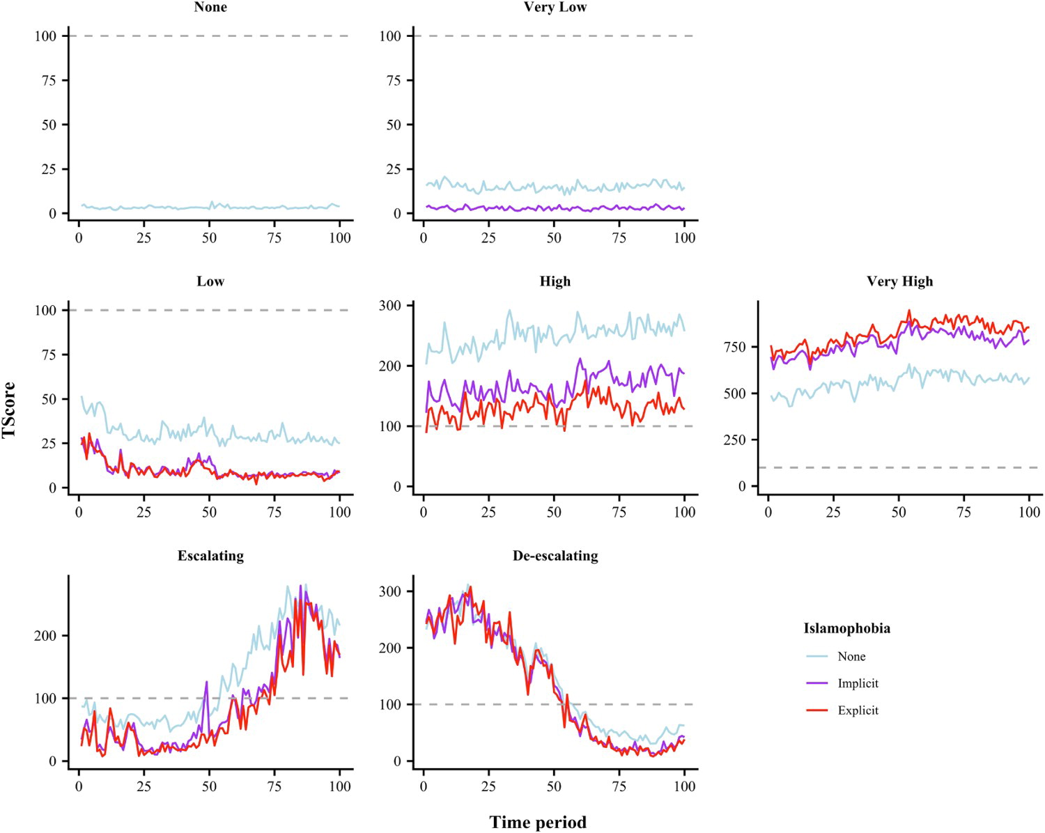
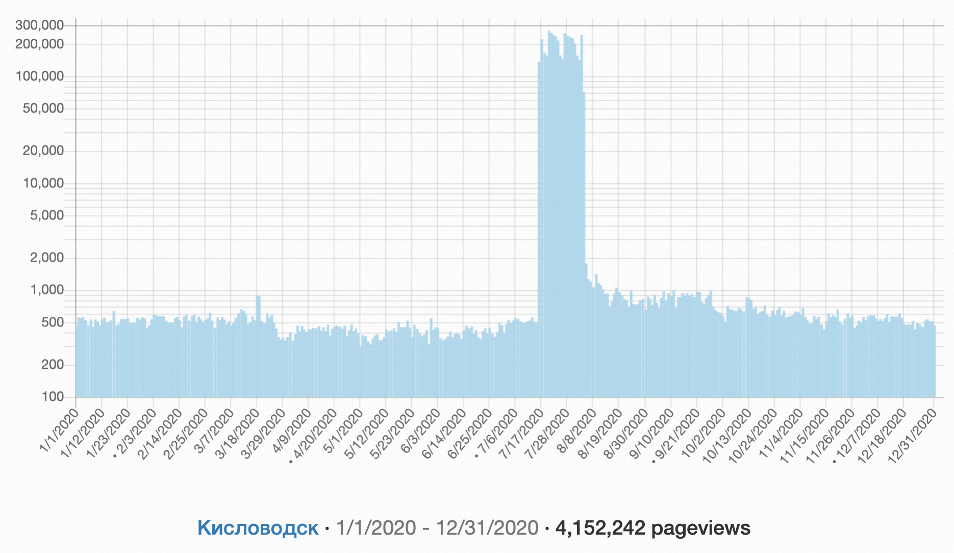
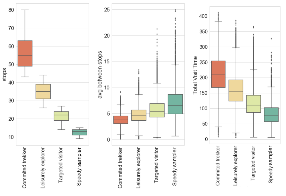
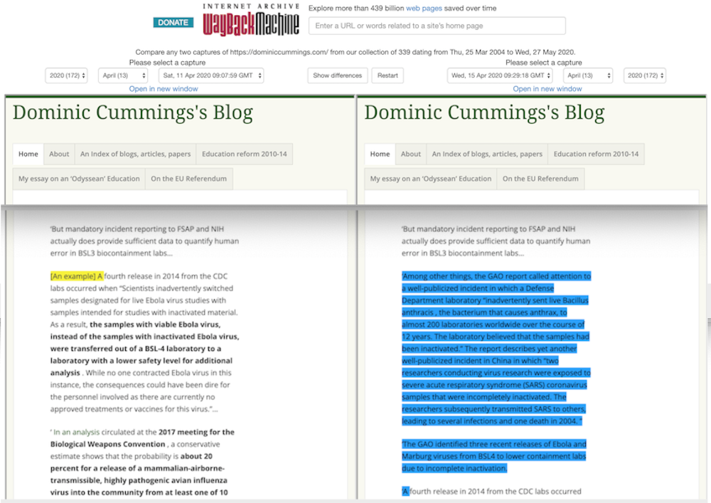
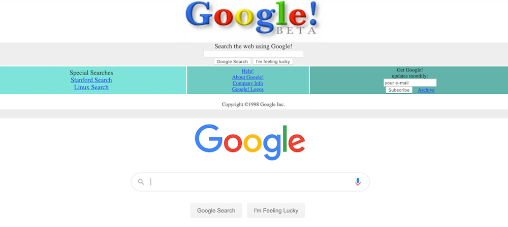
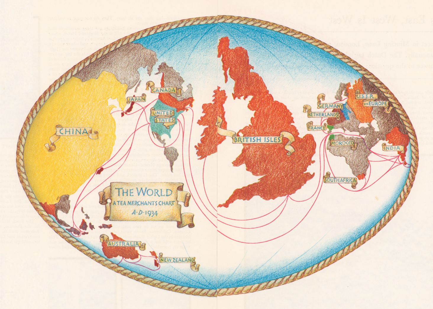

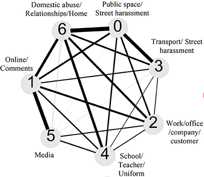
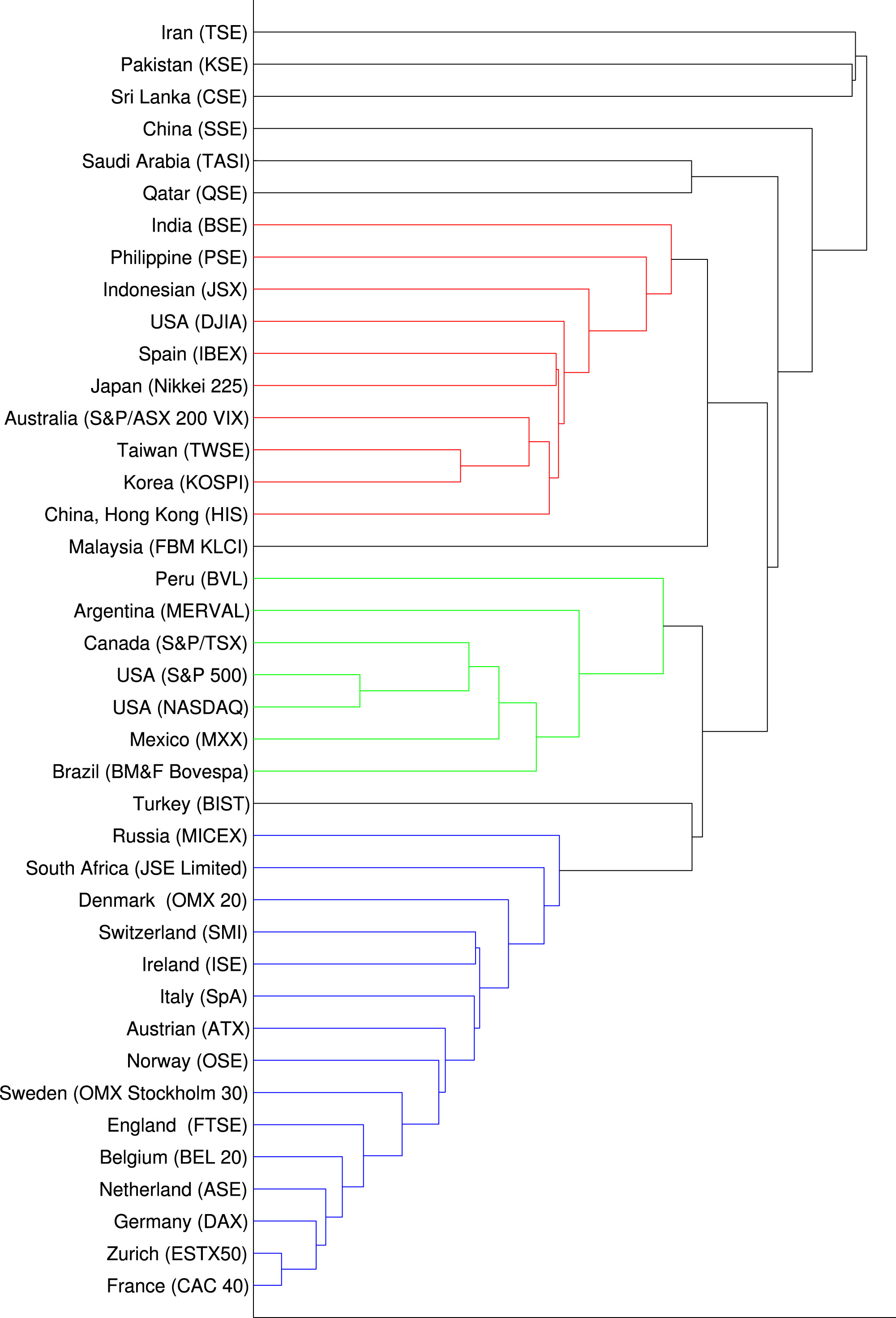
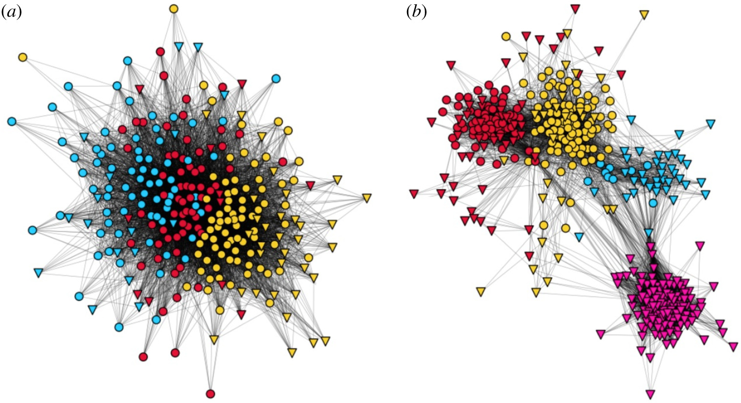
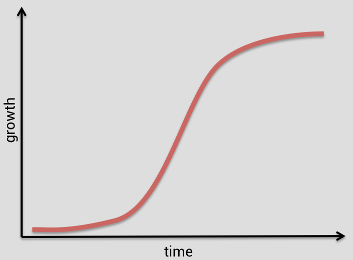
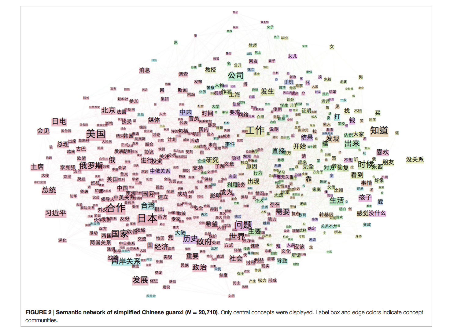
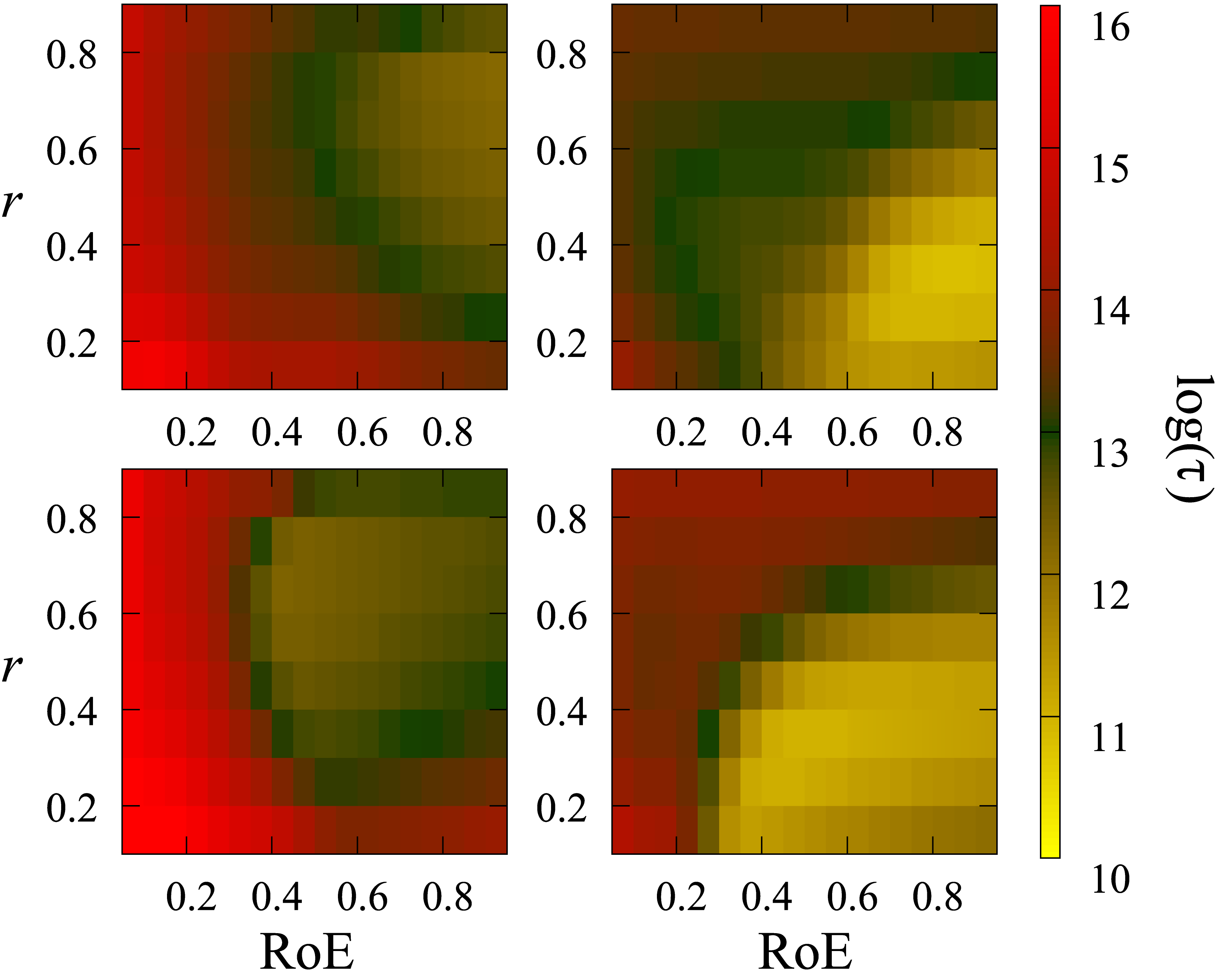

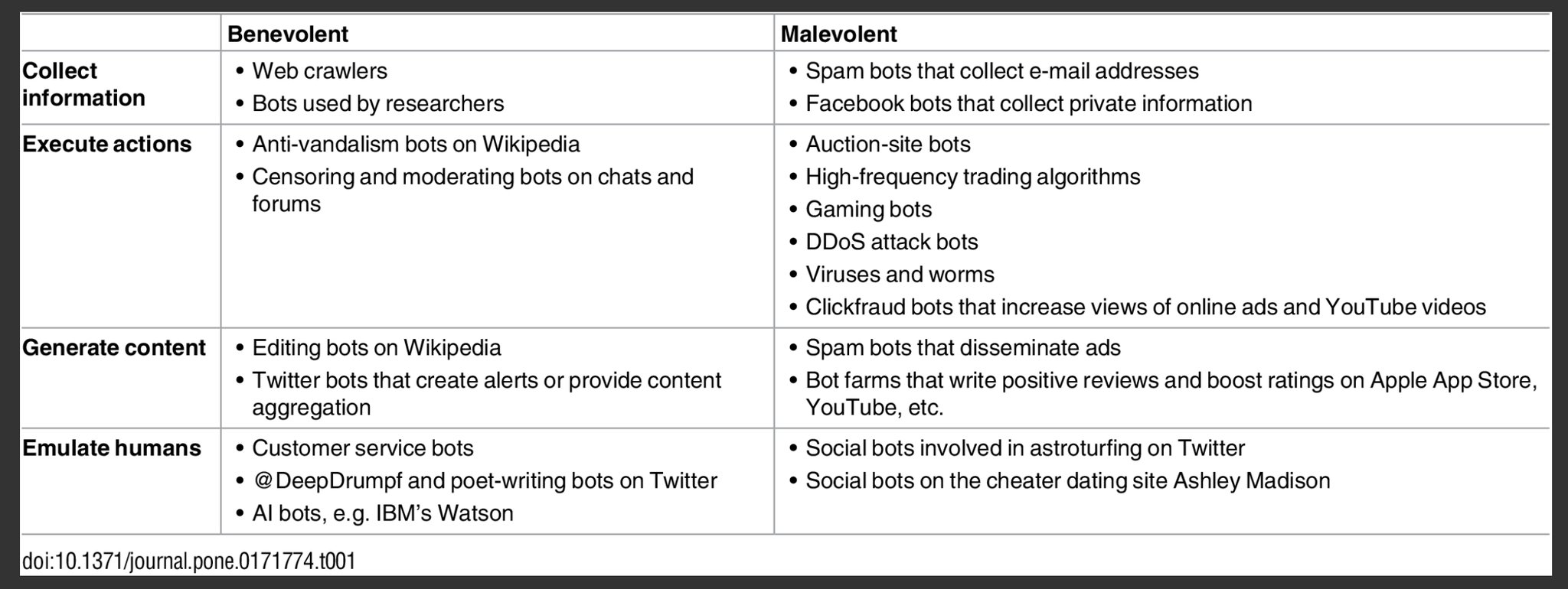

 The OII Colloquia, however, come closer to the original sense of the word: through this series of events we aim to initiate conversations and strengthen our ties with scholars at other departments of the University of Oxford, around topics of shared interest. They should be considered as a trigger for long-lasting collaborations between the OII and the speakers’ own departments.